Resources and References for images
|
|
|
|
The Cambridge Guide App
0:00 - Firstly when the the iPhone is on in its home screen the icon of The Cambridge guide is clear, the word underneath clearly says "Cambridge" which is a easy way the user can understand quickly what he app is about in the menu. When the app icon is clicked the loading screen appears showing a bright bold title naming the app again "The Cambridge Guide" which is easy to follow and the user knows from that what the app is about. Once the app has loaded the home screen appears displaying a large appealing image to engage the audience. Also a welcoming line to make the audience feel comfortable when using the app, "Welcome to Cambridge".
0:10 - The first interactive feature we see is the map which again is part of the brief as the client wants a informative map which my map will show the user destination they want to go including Starbucks as a destination pin point so they can find it and relax on their stay.
0:47 - The next page shown is the shopping page, this allows the user to be weekly updated with a new place we recommend they go to, this can vary from coffee shop to grocery shop. There is always a small written section where there is information about the store so the audience can find out a bit of information.
1:08 - The next page is the events page, here there is another interactive feature this being a link to a webpage, when the user clicks the link they are taking to the Cambridge Events page which is where they update the site with upcoming events offering vouchers and deals that the user can buy or book. They can also search for new events if the event shown is not in their interest.
2:05 - The final page shows the history of Cambridge providing more information of the town.
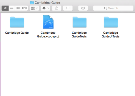
0:00 - This is the Xcode main storyboard and where I made my app. The storyboard shows five pages that have buttons, interactive features, images and colours on them. The view controllers of each page are linked together but he main view controller which is grey on the main storyboard. This is the menu bar at the bottom of the screen.
0:43 - Next we see the coding of each page, for the home page there is no coding added in.
0:49 - The next view controller is the shopping app which shows the coding of the link that doesnt show up on my app but it the link to the Starbucks page.
1:00 - The next page is the About page there is no code on this page as the information is not yet within the app.
1:06 - There is coding in the next view controller which is the map page. There is coding for the map to fit in the page as well as a pinpoint coordinations so that there is a point of the map showing a destination they should go to.
1:15 - The next view controller is the Events page which has coding of the link which when clicked take the user to the webpage and allows them to navigate the site.
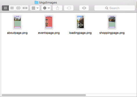
1:32 - The next thing I am doing is create another view controller this is so I can demonstrate how I have adding the image into the view controller. I then type in Image in the search and drag in the image code, i strech it a make it the size of the view controller. I then type in the image search "Aboutpage" to get the image for the about page once clicked, the image automatically appears. From here i have to right click and connect the image to the "view" option on the left panel, making it have equal widths and equal height then fixing the constraints. This is what i did for all the background on the pages.
0:43 - Next we see the coding of each page, for the home page there is no coding added in.
0:49 - The next view controller is the shopping app which shows the coding of the link that doesnt show up on my app but it the link to the Starbucks page.
1:00 - The next page is the About page there is no code on this page as the information is not yet within the app.
1:06 - There is coding in the next view controller which is the map page. There is coding for the map to fit in the page as well as a pinpoint coordinations so that there is a point of the map showing a destination they should go to.
1:15 - The next view controller is the Events page which has coding of the link which when clicked take the user to the webpage and allows them to navigate the site.
1:32 - The next thing I am doing is create another view controller this is so I can demonstrate how I have adding the image into the view controller. I then type in Image in the search and drag in the image code, i strech it a make it the size of the view controller. I then type in the image search "Aboutpage" to get the image for the about page once clicked, the image automatically appears. From here i have to right click and connect the image to the "view" option on the left panel, making it have equal widths and equal height then fixing the constraints. This is what i did for all the background on the pages.
DEMONSTRATE OPTIMISATION TECHNIQUES ACROSS THE INTERACTIVE MEDIA PRODUCT
To optimise my images and background images I have taken them through Photoshop to make sure the sizes are right and that they will fit an iPhone screen.
0:00 - This is an image from a previously made app from my teacher where the sizes are 414 pixel width by 735 pixel height. This is the correct size for an IPhone 7 app.
0:14 - I am adding in the image I made for my app, this image is the wrong size so I'm putting it up against a previously made app where the colours are correct so i can make the image the right size.
0:37 - Here I am saving the Image for web so then I can make the image the right format for the platform.
0:48 - Here I am finding a preset that works best with the picture. When I click on PNG-8 you can see that only a few colours are selected in the colour table showing me that this preset does give me all the colours i want to make the app look the best it can.
1:29 - After selecting GIF Restrictive, you can see that a select amount of colours are restricted making my piece not look so sharp and bright. This isn't what i want as it may denote that the city is not very pleasant, bright and beautiful.
1:38 - Clicking on Gif 128 dithered also comes up with the colour restrictions.
1:42 - Going down the list I am trying to make sure that the preset I choose doesn't have any restriction so i know that my app will look the best it can.
1:56 - Shows me that the preset JPEG doesn't have restriction by the colour table displaying no colours but I know that the quality is better on the preset PNG 24 because the pictures are crisper as well as the file size being smaller which means that it will take up less space. Also it means that the image will load quicker in the app.
This means that the user can have a better experience as they can load the app quicker and interact quicker too.
