P1 - DESCRIBE INTERACTIVE MEDIA PRODUCTS
|
First product - Facebook website
What is the actual purpose of the product?
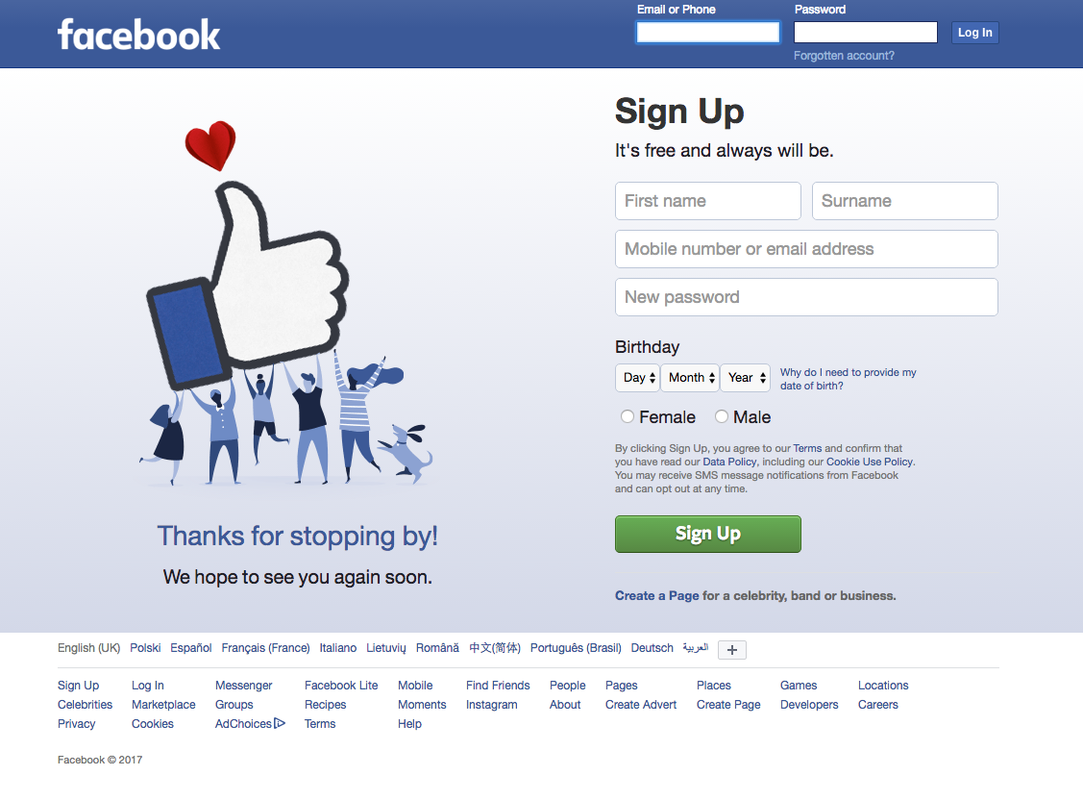
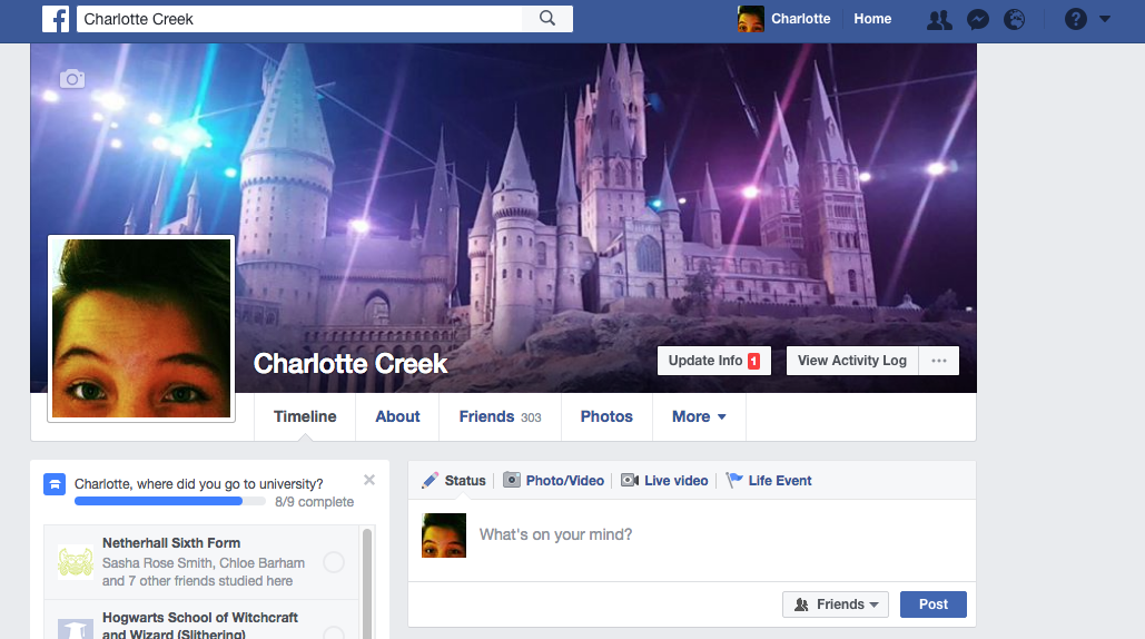
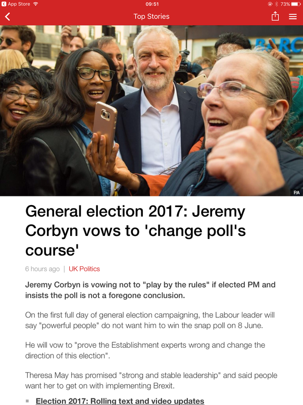
The first product I am looking at is Facebook which is an interactive social networking website where people can communicate with each other and share post of anything they want to their friends and family. The purpose of the site is to allow people to connect to one another making it easier to communicate over a distance of space helping people with long distance friends of family, sharing interests, creating a community with friends or group colleagues and making messaging, calls, picture sharing easier. So the purpose is to make interaction easier and simpler where ever you may be (otherside of the world, overseas or round the corner). |
|

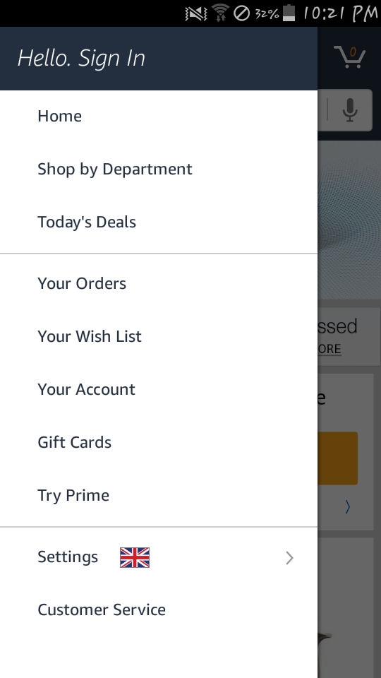
The other platforms this interactive product is available on and which is your preference?
Facebook is available via website on any device, also a Facebook app has been made that is compatible of all devices, Android, IPhone ect. Also there is a Messanger app that is also from Facebook that covers only the messaging aspect of Facebook making it easy to just message from this additional app them Facebook its self. I prefer the mobile app as i use that more often then i do the website just because i mainly use my phone just because i always have it, even if i have my laptop i still use the mobile app over the website because its easier and Im use to is compared to the website where i feel there is a lot of unnecessary things embedded onto the site that aren't needed or at least I don't wanna see them like and interactive tab where you can access news and different genres.
Facebook is available via website on any device, also a Facebook app has been made that is compatible of all devices, Android, IPhone ect. Also there is a Messanger app that is also from Facebook that covers only the messaging aspect of Facebook making it easy to just message from this additional app them Facebook its self. I prefer the mobile app as i use that more often then i do the website just because i mainly use my phone just because i always have it, even if i have my laptop i still use the mobile app over the website because its easier and Im use to is compared to the website where i feel there is a lot of unnecessary things embedded onto the site that aren't needed or at least I don't wanna see them like and interactive tab where you can access news and different genres.

|
|
|
|
|
The design components and layout and your experience of it.
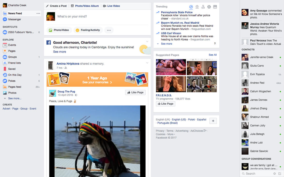
The design is fairly simple and easy to understand. If the site is new to you when you hover over a tab or link, like the messages button it says "messages" to make it easy to understand. Its the same with everything like when you hover over a page that come up on your feed, the name of their page is interactive so when clicked Facebook will take you to the page but hovering over it will show a glimpse of the page allowing you to click or not.
|
|
The interactive features of the product - what are they and what’s your experience of them like?
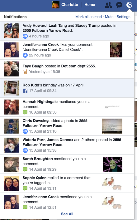
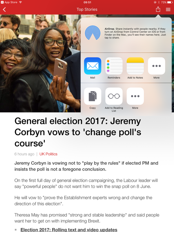
Below are some screen shots i took of some of the interactive features. The screen shots show buttons and links that connect the site up or take you to other sites to further information. These are used to make the experience easier and more enjoyable as you are able to access a range of different things quickly and simply.
|
|

|


|


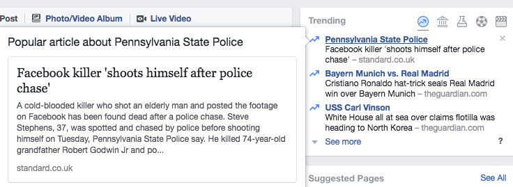
Some of the interactive features are tabs these allow you to click on them giving you further information about them including recent activities. For example the picture to the right is the interactive face I received after clicking the "world interactive button " at the top which is notifications. This is a tab down showing me all more recent notifications making it easier for me to know what is going on or what is being said about me.
|
|
The benefits of the interactive product
For the media platform Facebook there are a lot of benefits I feel :
- The Website is easy to use and understandable
- It makes talking to people who lives far away easier, for example if your friend moved to a different town, and you never saw them Facebook would be a benefit here as if you were friends online you could message each other and share activities they may care about too. This makes the user feel good and happy as the interactive social media platform makes everything easier and in some cases possible.
- Sharing, liking, commenting. These are great ways to express your opinion and on Facebook this is possible. You can share important news with your friends and family. Like a post from someone, or comment on a post so you can communicate with other users.
The limitations of the interactive product
There are also a few limitations with the interactive face of Facebook, for example:
- When using the website a limitation i think is the trending section on the homepage. I personally think this is a limitation as I do not always want to see that on me feed as it is sometimes irrelevant and boring compared to the social fun interaction that is Facebook.
- Another Limitation I feel is the privacy settings as i feel like my data isn't always safe on Facebook which is a worry as Facebook holds a lot of my personal data like age, address (location), recent activity. The privacy isn't always mention either so its not like they make sure that your data is safe whihc is dangerous for the user.
The effectiveness of the interactive product
I think that the app is very effective as it has definitely added to my life as it has made messaging so much easier especially because i don't have texts or calls already on my phone, its is the only way of my interaction. In term of its purpose i feel it is very effective as it purpose was to "make interaction easier and simpler where ever you may be" i think this is very effective as as long as i have internet the interactive product can be access and used.
Are there any legal and ethical issues of the interactive product?
A big issue that could occur with Facebook is the Data protection act as everyone puts data into the site even signing up when putting in your email, age, full name, address. If this data is leaked without peoples permission, this could be bad as it would break the law as well as everyone personal data being leaked which is scary for the user cause the privacy settings are already unpredictable so everyones data being leaked would be really bad.
Second product - BBC App
What is the actual purpose of the product?
|
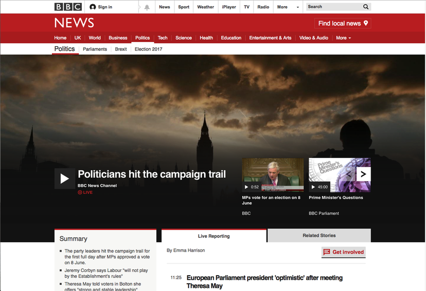
The next product I looked at was The BBC app, this is available on IOS and Android. The purpose of the app is to inform and educate the audience about current events in the world including politics, crime, science etc. The app is a news app that cover everything happening in the world today . This app falls under journalism for an interactive product and coves all times of news.
|

|
The other platforms this interactive product is available on and which is your preference?
The app is available also as a website which is reachable from any device, iPad, Phone, computer anything that has internet. The website has a lot information like the app does too. I don't usually use the BBC website or app at all but I do prefer the website over the app just because that all I use when I access the site. I think its easier to use and a lot quicker when you're trying to find a specific news story.
The design components and layout and your experience of it.
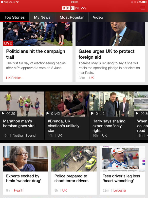
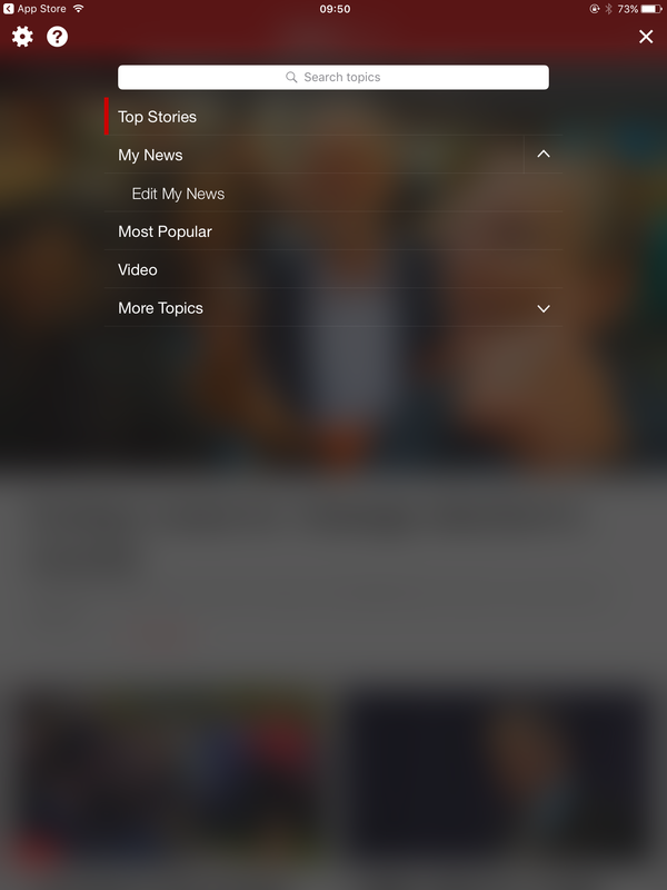
The design layout is fairly simple as the stories are easy to access on the homepage. The BBC news logo is at the very top of the page with the most recent story below. Just before the stoies there are 4 tabs that allow you to access your own news stories, popular stories and news story videos. There is a menu access at the top right of the screen that enables you to search for a topic, the already listed tabs and a more topic down bar.

|
|
The interactive features of the product - what are they and what’s your experience of them like?
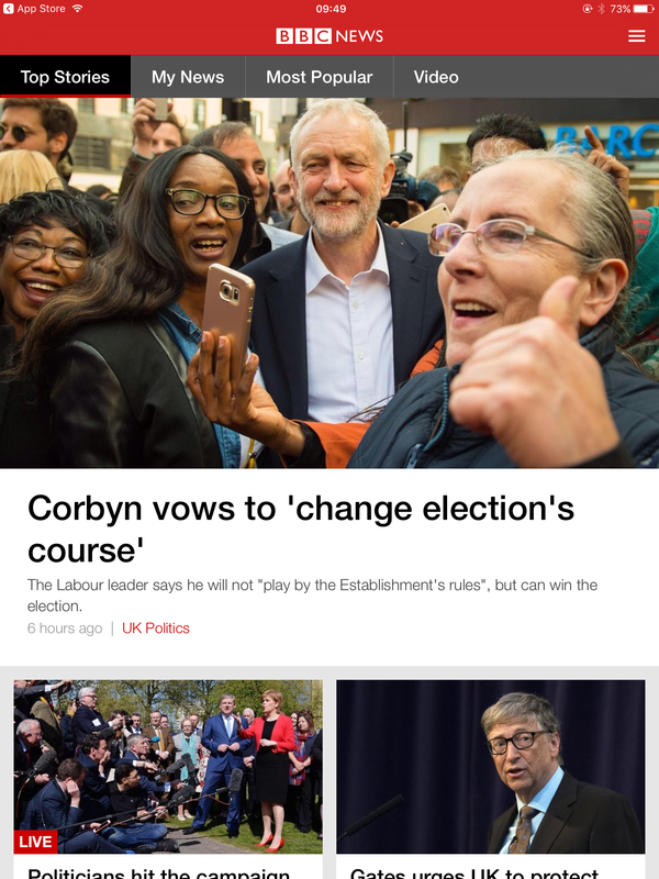
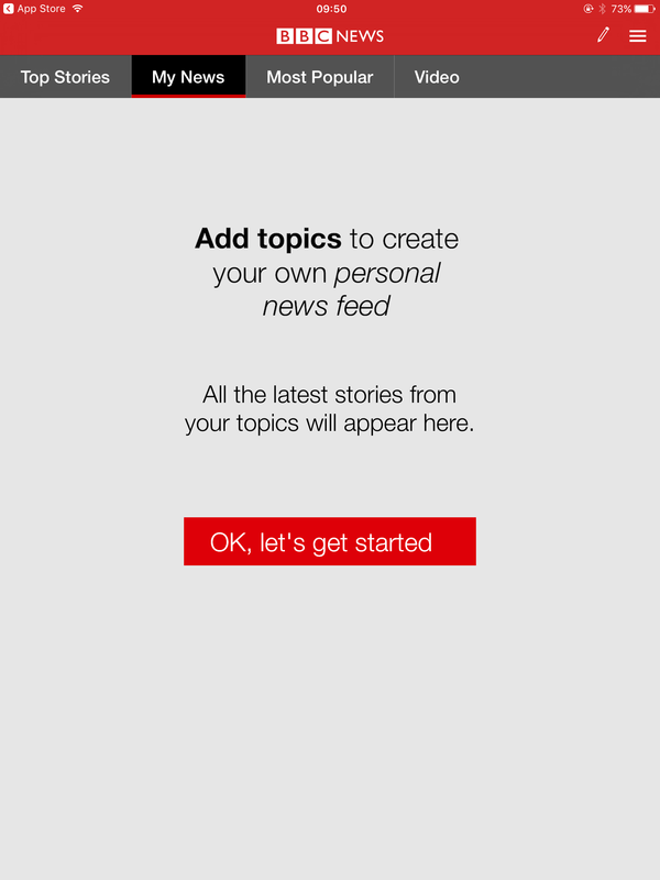
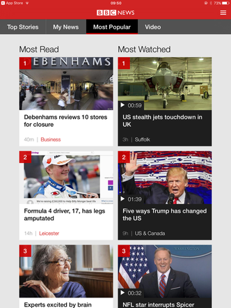
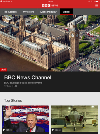
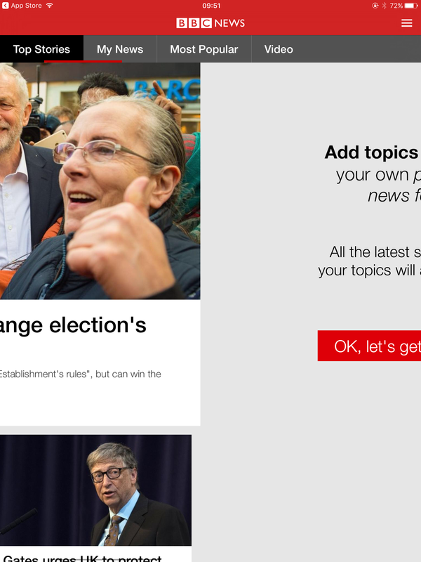
The app uses many interactive features , when you first download the app, the first thing you see when you open the app is an alert asking whether you would like notifications. To which you can click yes or no. After that the page that is next is the homepage, showing the most recent story in the world. This is under the tab top stories, you are able to slide the screen across to the left or click the "My News" tab bringing you to a screen where you can add topics to make a feed of stories that appeals to you so say you like reading crime story, you can add this topic to your feed so you can view all stories to do with crime to personalise the app and see the content you want to see. The "Most popular" tab takes you to a feed of story that are being view the most, here you can see what story are trending in the world now within the app allowing the reader to know everything current at the moment. The tab "Videos" takes you to a long feed of different news story videos. The menu in the top right takes you to a a screen showing a search bar, "My News", "Most popular", "Video", "More topic".
|

|
|
|
|
|
|
|
|
|
|
The benefits/limitations of the interactive product
|
There are a lot of benefits of the app:
|
There are also a lot of limitations to the app:
|
The effectiveness of the interactive product
The effectiveness of the app is pretty high i feel, i think its a very good app to get news from, I feel it is very easy to use and navigate also the news being update a lot makes me believe that site is good at keeping the audience informed. The notifications are also effective as the alerts pop up on your phone informing the reader of the new story they may like making them want to read it.
Are there any legal and ethical issues of the interactive product?
This interactive product may have a legal issue if the accuracy of the product is not completely true then this breaks the law as all news stories must be true to not lean the audience or be biased cause if the article were to have incorrect information it would completely fool a whole country. Because people check the app a lot to catch up if inaccurate data is included the audience may be affected.
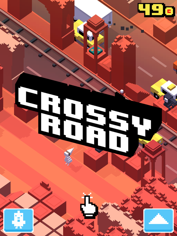
Third Product - Crossy Roads app
What is the actual purpose of the product?
|
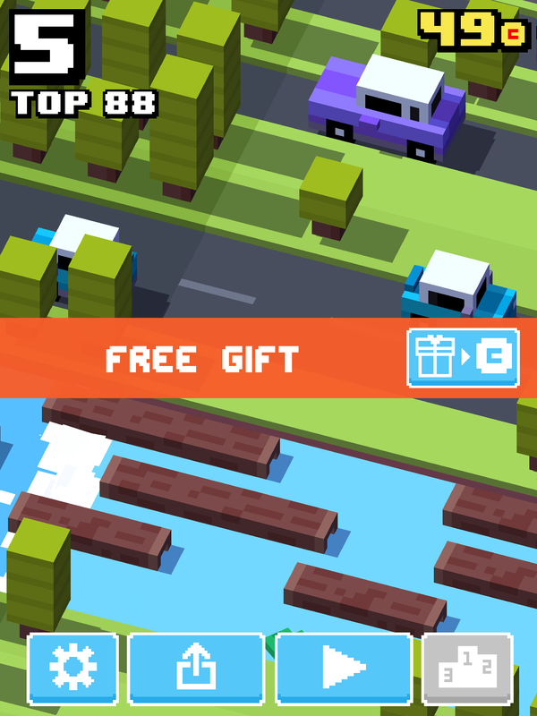
Cross roads is the final application I looked at the purpose of the interactive product is to entertain the audience and make them enjoy the game and want to play more. It allows the audience to play game, share their results and collect fun skins of different characters making it more personal.
|
|
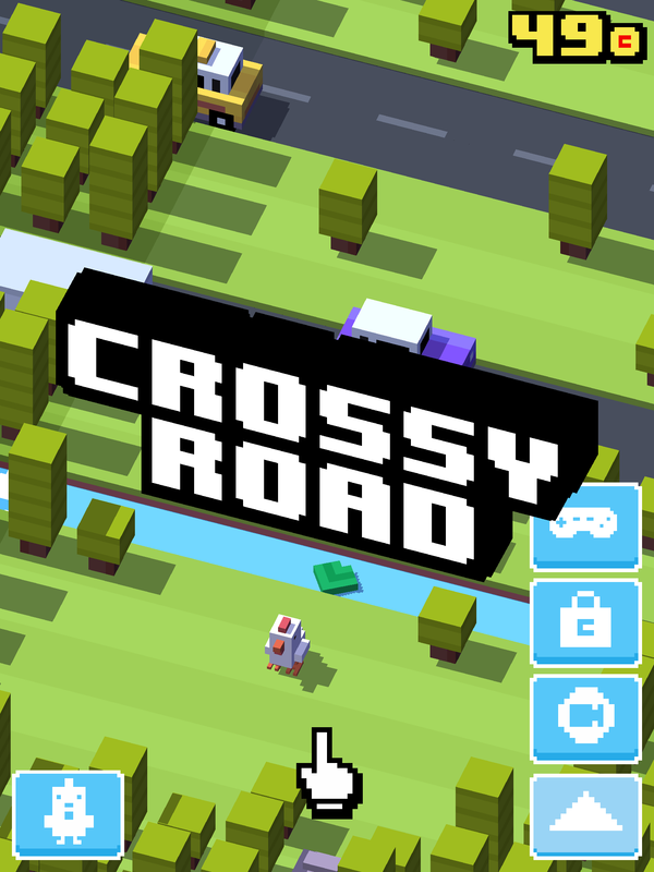
The other platforms this interactive product is available on and which is your preference?
Crossy roads is available on other phone platforms like android and windows as well as IOS. The application is is also available on the Microsoft store therefore for computers too. The application is also available on tvOS meaning appleTV, this can be accessed in the app. My favourite interactive way with this game is through IOS on apple devices because this is how i have always used this app as i believe it works best, compared to computer where i feel it wouldn't be so enjoyable and fun to play.
The design components and layout and your experience of it.
The layout is vey simple to use and navigate as the button images are varied and different for each making it easy to know which is what button. My experience with the design was fine i found it really easy to learn so developing an understanding for the app is simple. However there are restriction to the site like i feel the game would get boring as the application is too simple for my age and it could get patronising.
|
|
The interactive features of the product - what are they and what’s your experience of them like?
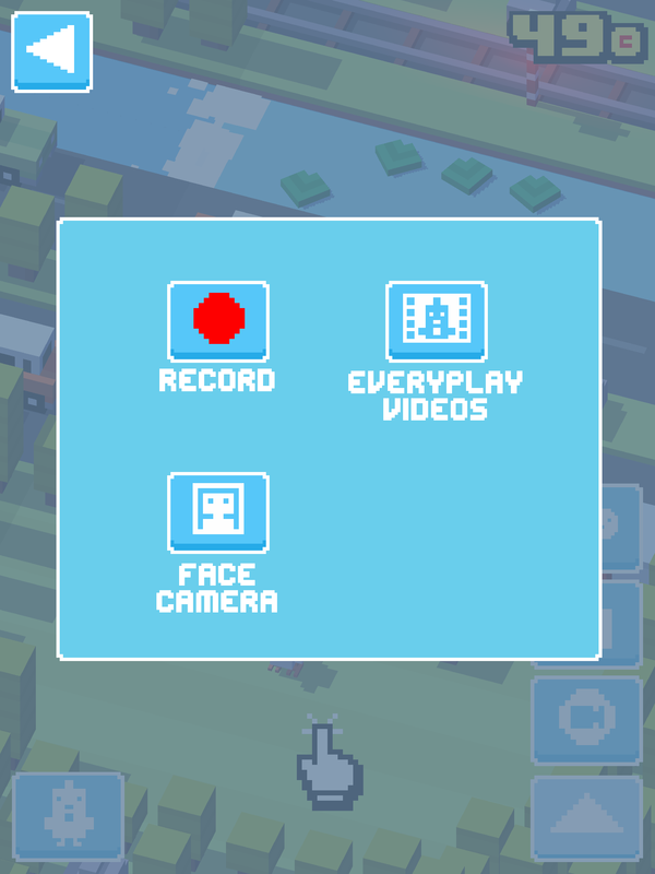
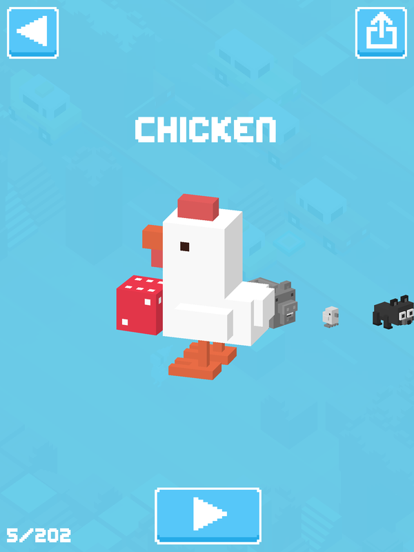
The first thing you see on the page is the logo "Crossy Roads" The button on the front page at the bottom left of the screen allows me to access the characters quickly the button at the bottom right of the app, is a tab bringing up a range of different buttons, the first is a connection that can connect the game to the Apple TV (if you have one) in your house. The next button is a bag representing a store, by clicking this link it sends you to the online store via your internet browser (Safari, Chrome ect). The next button is a record button where when clicked asks how you want to record, screen, camera.
|
|
|
|
|
|
The benefits/limitations of the interactive product
|
There are a lot of benefits to the app:
|
There are a lot of limitations as well:
|
The effectiveness of the interactive product
The product is very effective as i use it and enjoy playing it. In terms of the purpose it is effective in making the person playing have fun as when i play it and people I know play it they have fun with it so it is effective and works very well as a fun interactive app.
Are there any legal and ethical issues of the interactive product?
There could be legal issues within copyright, if the name "Crossy roads" is already taken this could be a problem for Disney as the name was already someone intellectual property and could get into trouble. Also because the concept has been previously done, "Frogger" they could get charged for that as it has similar gameplay and concept.
M1: COMPARE AND CONTRAST THE USE OF DIFFERENT PLATFORMS AND FORMATS FOR DELIVERING INTERACTIVE MEDIA PRODUCTS
Amazon shopping application
The design components and layout.
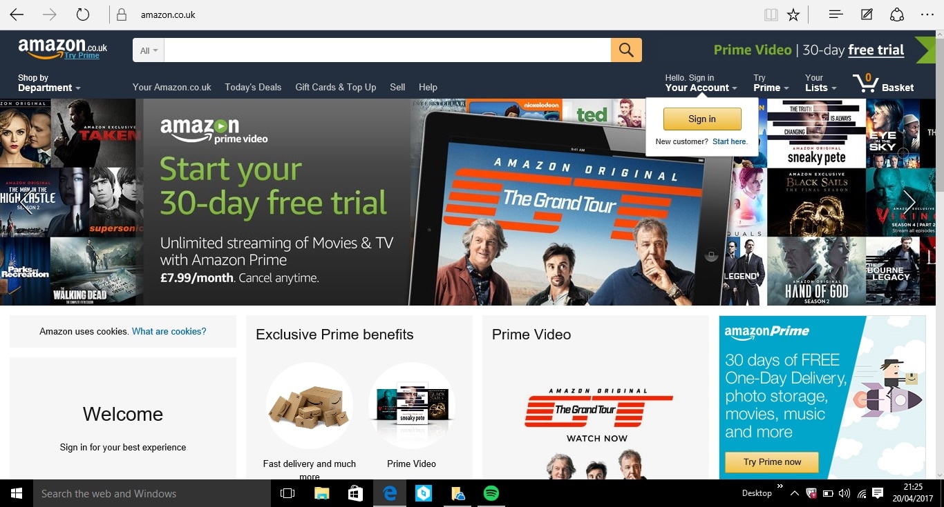
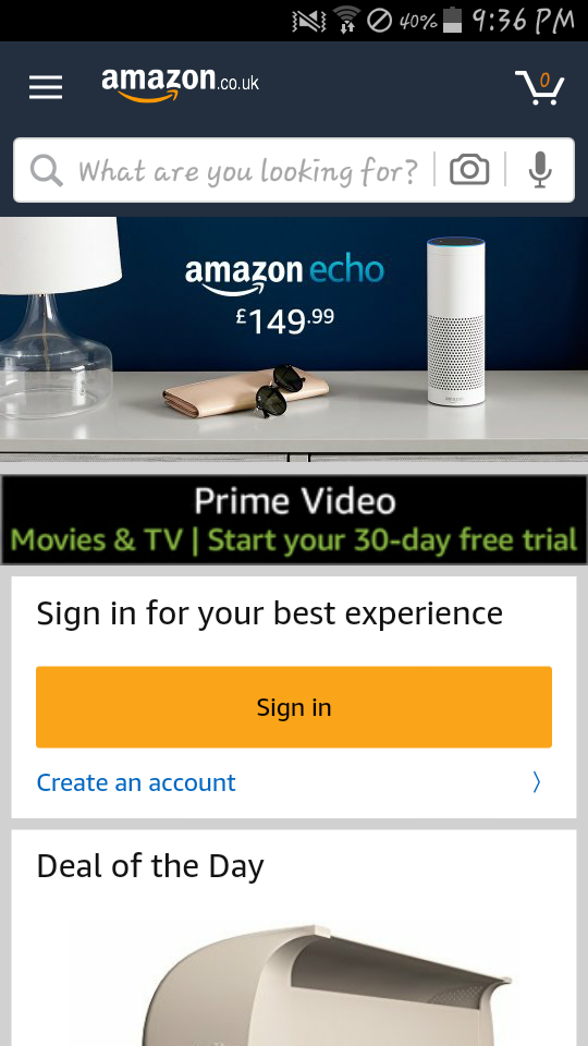
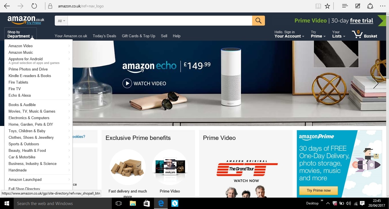
The amazon webpage and the app have similar and different components and layout. For example a similarity is that when you first open the Amazon app and the website, the first thing you see is the advertisement, this is normally for "Echo" but sometimes there's other amazon products like Prime. Another similarity is the fact the font stays the same as well as the logo being always at the top, letting the user at home know what site they are using site. This allows the app to be known what every platform its on with its easy to read company name with the mustard yellow colour and the simple font. Another similarity is the search bar, this is displayed at the top of the app homepage as well as the amazon website this just makes it easy for the customer to easily access the search bar and find what they want. Also "Your basket" remains in the top right corner on both the app and the website. However when comparing the too, there are some differences for example the search bar tabs are different on the app, there is no option to change the department you search either you put it in before in the menu bar at the top left of the app homepage or after searching and filtering the search to a specific department, which is a hassle when you want to find a product quickly so this is not very sufficient. Another difference on the search bar is that there is no microphone or camera displayed on the search bar on the website 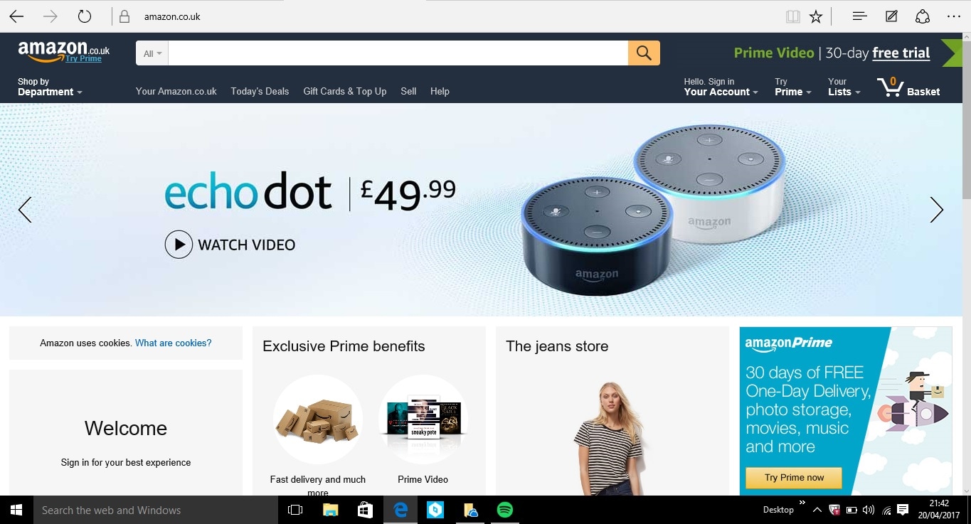
|
The interactive features of the product
I feel like when I compare the app and the website the website has more interactive features, as just on the home screen you have plenty of tabs, buttons, links to press whereas on the app, there seems to be mainly a menu with a few buttons. However both websites have interactive drop bars and tab menus that allow you to access further shopping departments. |
|
|
The benefits of the interactive product
|
The app
|
The Website
|
The limitations of the interactive product
|
App
|
Website
|
The effectiveness of the interactive product
Both website and app are effective. The app is effective if you are using it away from home if you're out and the website is good for casual home buying and searching as the accessibility is a lot more thorough on the website than the app. I feel some feature on the app are more effective for the user than the computer like the barcode scanning with the camera as the app can be utilised a lot better and in a more clever way, this makes searching easier. The website however has more specific search devices over the app, because of the easy department setting on the website whereas its harder to adjust on the app.
BBC Bitesize app
The design components and layout.
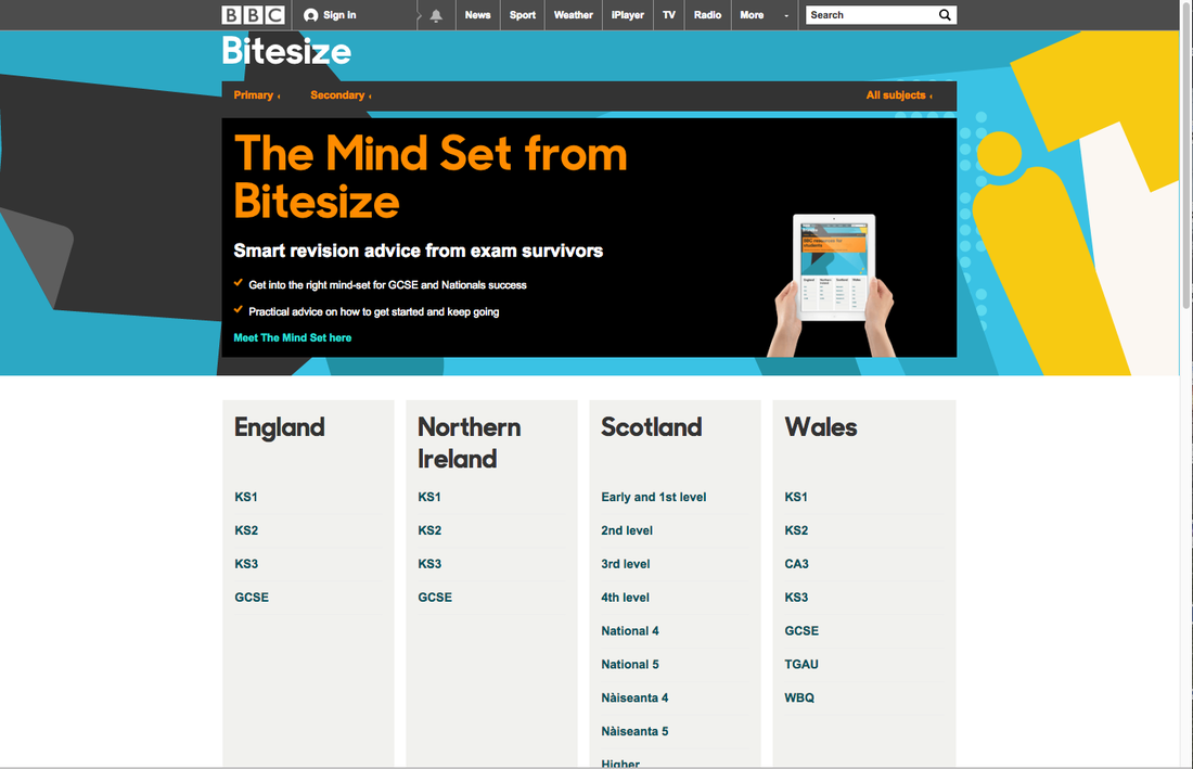
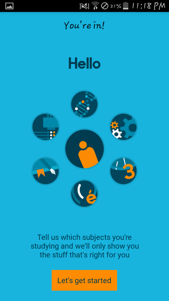
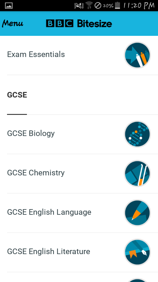
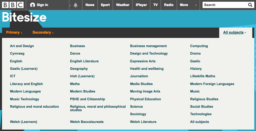
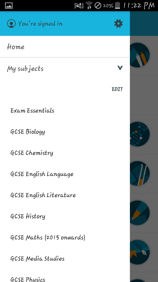
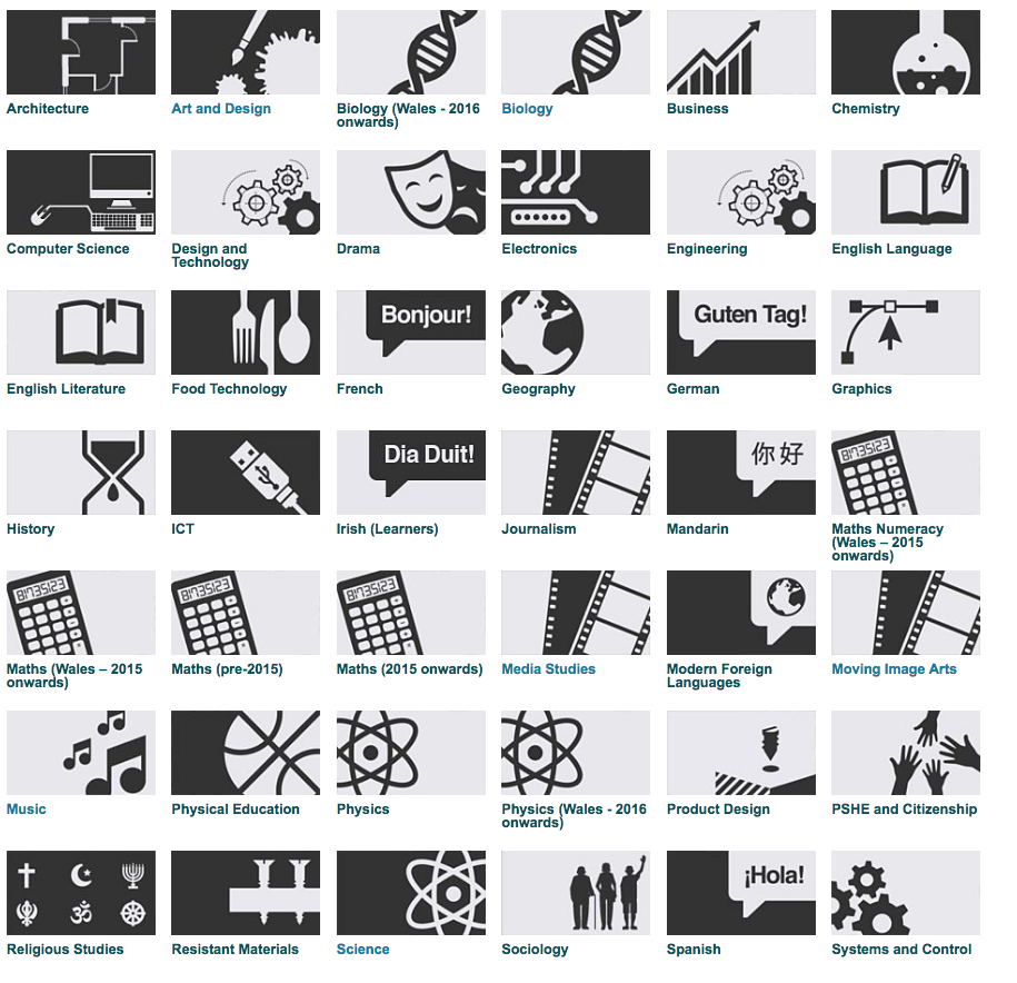
The design of the website and the app are very similar using the same colours and font style. When you come to the website you don't have to sign in to do revision whereas on the app you have to sign up and create a profile, this is done so they can get your specific classes and subject you take making revision easier whereas on the website you have to search through tabs to find the subject you take. On the right is the home screen for BBC Bitesize app, it displays your subjects so you can get straight into revision. Compared to the Website homepage above where you have to click 'secondary' or 'GCSE' to get to the subjects. Also you could click 'all subjects' to get a dropbar of different subjects. The BBC Bitesize logo remains at the top reminding the user what app they are using. The subjects are displayed differently, with the app they are more appealing compared to the homepage subjects after clicking 'all subjects' its only words. |
|
The interactive features of the product
The website has a lot of interactive features as there is a lot more to access as the subjects list is longer and all subjects are available to access. Where as if you put your subjects into the app, those are the subjects you see. At the top of the BBC Bitesize website there is a long line of links represented by words like 'News', 'sport' tv' these words when pressed tae you to that BBC site, so clicking 'sport' take you to the BBC Sports website. This interactive feature is not available on the app as I feel this would make it too packed also the app doesn't need it but to have the links would be nice. Another interactive feature of the app is the the flashcards where the user can use them to revise and test themselves on the topics. However on the site there is no flash cards and instead theres more information written out, There are no games or flash cards. Another difference in that the website has a search bar so the use can search for a specific thing. However the app does not have this feature so you need to scroll through the subject to find the topic. The website and app both have videos to watch as well as slideshows of pictures and information. The app has a menu tab where you can access things like your account and subjects. Whereas the website doesn't have this as 'my subjects' isn't available.
|
|
The benefits of the interactive product
|
App
|
Website
|
The limitation of the interactive product
|
App
|
Website
|
The effectiveness of the interactive product
Both the app and the website i feel ae not that effective personally for learning as i don't find them very helpful for my learning and revising techniques however i feel for someone else it may be more effective. Both app and website have a lot of effective as the app is convenient and the website is packed with more information. The app is more effective for people who like learning through flashcards or games but the website is effective for people who like learning through a lot of information, videos and picture. I personal prefer the app as its more tailored for the user there i fell more effective at helping with a specific unit.
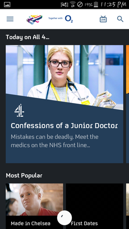
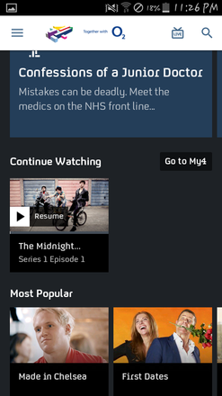
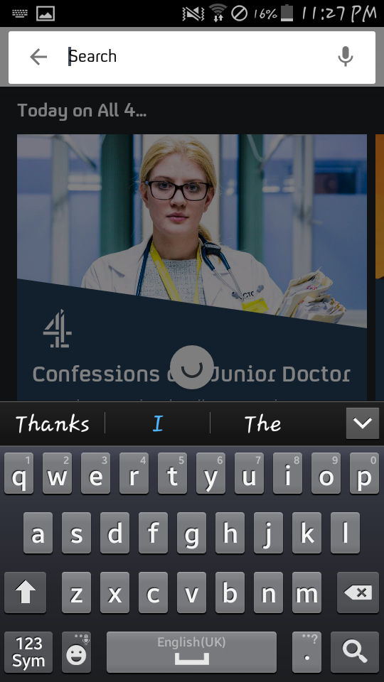
Channel 4 App
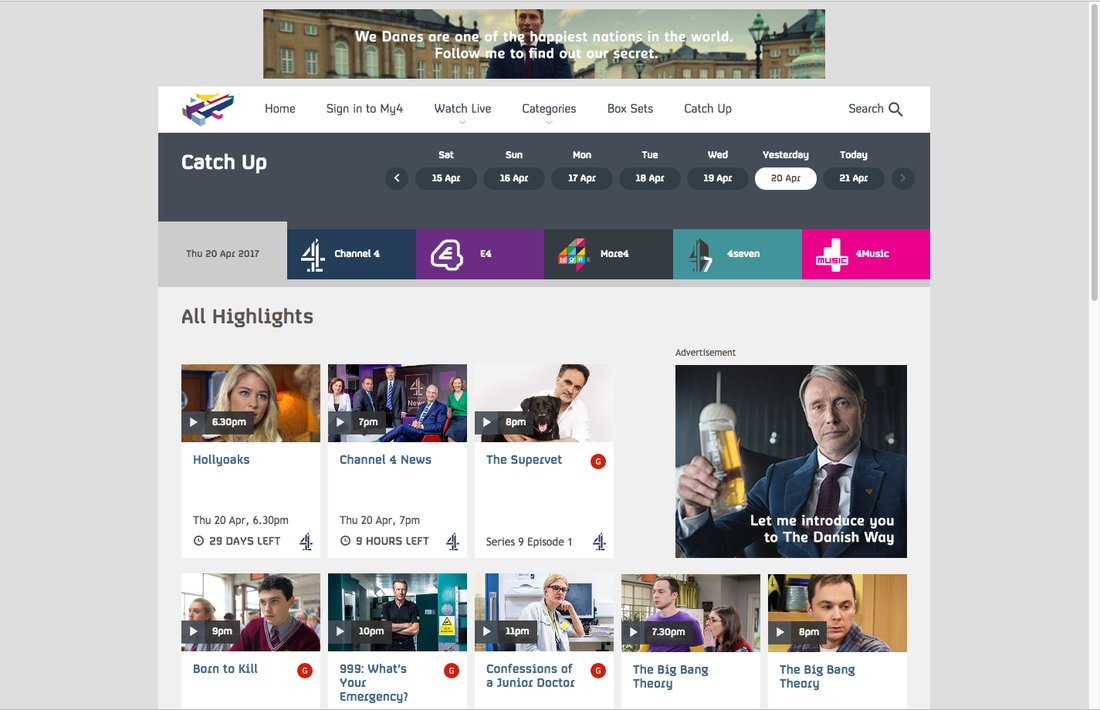
The design components and layout.
The layout of the website and app are similar as the both homepages show popular shows at the top and further down are recent episodes of loads of different shows. Both the app and the website have the dark grey background colour as well as the company name. However the sponsor of the app is at the top next to the company name on the app being O2. Another similarity is the search button where the user can search for show to watch. However the the live button is right next to the search button but on the website it is in the button section at the top of the app. Below the most popular is the continue watching section that allows the user to keep watching their show. This feature is available on both app and website. The font is the same from website to app, with the logo displayed on the face of the most popular show today. 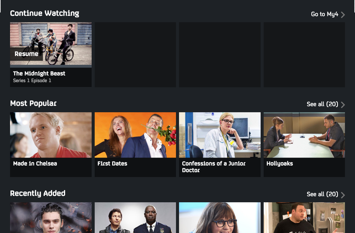
|

The interactive features of the product
I feel like both the app and the website have a lot of the same interactive features and are very similar. For example, the interactive search works the same on each platform. Another feature is the user can sign in meaning they are able to get the 'continue watching' feature which is on both platforms. However on the the website you are able to share what you are watching to social medias like Facebook but the app doesn't have this option. The app, when you first open it, has a notification option that alerts you when your show is on, but the website doesn't have this option.

|


The benefits of the interactive product
|
App
|
Website
|
The limitation of the interactive product
|
App
|
Website
|
The effectiveness of the interactive product
I think that both the app and the website are very effective as they are both very easy to use and navigate. Also because they are so similar they are both effective in their own, the app is effective when you are out and have access to wifi and the website is a good platform to use when you're are home. I think the notification set up for the app is very effective and would be used a lot as it could alert someone about a show if they forgot. The website is easier i think to navigate as everything is on the homepage but i prefer the app as its convenient.
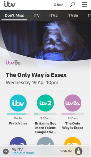
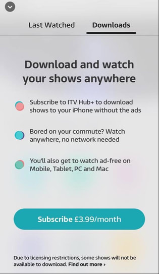
ITV Player
|

|
|
|
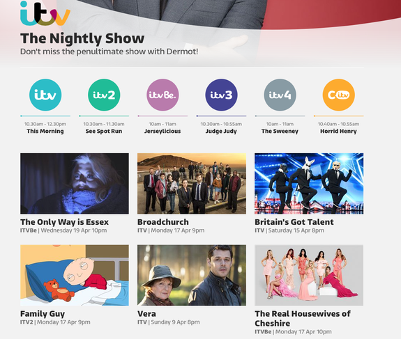
The design components and layout.
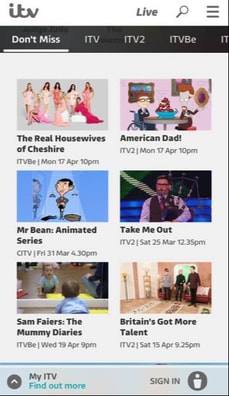
Both the app and the website look very similar. Both load on a homepage where the user can select which ITV channel they want to watch. The first page also displays recent episodes of the most popular series on the ITV channels. Both channels have a scrolling page which allows the user to look at more shows and episode on the same homepage. The colour schemes are very similar sticking to the dark grey theme on both platforms. Also the rounded theme with the circles is seen on both platforms which makes them look very professional and easily recognisable. On both the font remains the same, its simple and easy to read which is important for the user to follow.
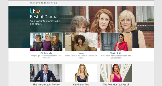
The website has many hyperlinks with the picture which allows the user to click one and take them to that page. If the user clicked "Best of Drama" on the picture above it would take them to a page with many dramas on them. However I believe the app is more interactive as there are options for the user to be notified when they favourite shows are being aired or a new episode is up. Both the app and website have a search bar where the user can look for shows they want to watch. Another feature on both is the ability to sign in and tailor both platforms to your preference by watching shows then having similar shows come up making them both personal. However the website has a feature the app doesn't which is to share what you are watching now using the hyperlinks for sites like twitter and Facebook.
|
The interactive features of the productBoth the app and website have interactive feature that make both easier for the users. This creates a more enjoyable experience for the user.

|

|
|
The benefits of the interactive product
|
Website
|
App
|
The limitations of the interactive product
|
Website
|
App
|
The effectiveness of the interactive product
Both the app and website are very good and easy to navigate so the use can enjoy there time using the ITV Player on whatever platform. The only thing i would change is the ability to download a show on the website because laptops are so common so having a download available this means laptop users can access their favourite shows without wifi.
