P3: Produce a plan for the creation of the interactive media product from the generated ideas
Purpose
The purpose of my multimedia product is going to take the form of an app, the app can later be adapted to a kiosk. It will interact with the user to allow visitors to the town to find out information about the city. As well as allowing local people the ability to know what the upcoming events are on in the town. In addition it will promote and educate Cambridge by promoting the scenery, shopping and history behind Cambridge, also letting the user know where to go while using the app with a map. The main purpose is to raise the profile of the city on the internet as well as providing visitors with information about the town.
Clients Needs
The clients needs are that the app is easy to use so the user finds the app simple but effective this is so everyone can use whatever their age. I intend to do this by making the GUI have a simple layout with clear buttons and an easy to use layout. Also the app needs to give the user a positive experience making them enjoy using it and also think positively about the town too. I intend to use images that will make the user experience more engaging and enjoyable as this will reflect the attitude of the people in the town. The client also wants the information provided to be "up-to-date", so in my case the history information about the city has to be from a reliable source as well as it being 100% as it will be biased and misleading to the user. I intend to do this by gaining my information from reliable sites that are are up to date with there data so that the content is not misleading.
Target Audience
The target audience is mainly students and tourists that maybe new to the town and want to know the history behind it and want to go to some shops within Cambridge and find new places, however i want to fully target 18-45 as the age range in Cambridge varies and i want to appeal to a lot of people. I am going to target this age range by using a range of colours that are appropriate for all users like pastel colours that everyone likes. As well as images of the city that are appeal to all. Also in terms of content this will appeal to the target audience as there will be content for all, events for everyone (festivals, punting tours). There is no specific gender I am trying to target with my app however it could be argued that I am target a female demographic with the shopping culture but I am not and the shopping aspect of my product is for both male and female. I think the user will have disposable income as the app can help the user find shops meaning they have enough money to spare to buy from shops.
Target Audiences Needs
The target audiences needs are:
Content
The content of my app will contain two interactive features which are:
The homepage will have buttons at the bottom, location which will be a map, shopping areas, about page which is a bout Cambridge and a gallery. I intend to do this by creating buttons that are clear to identify The shopping section will have content of different shops to go to and best of the week. The Cambridge quiz will be to test the knowledge of the user about Cambridge. The history content will have pictures and facts gathered from reliable sites. The gallery will be a selection of different photos.
Format
The format will be for an IPhone 7 because it is the most recent released phone for IOS. Therefore the format I'm using is IOS as i know about that format and use it myself. This is format is good for the user as it is simple to use and most people around the world have phones and have access to the app store where they can get the app. It is said that in 2015 Apple has sold over 700 million IPhones making it the perfect platform for my app. In future years the app could be adapted for android devices.
Platform Budget
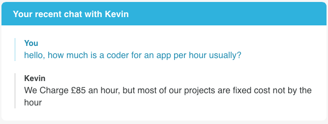
To make an app there are a lot of different requirement needed which could cost me. For example a coder with experience will be needed to pay for, this will ensure a good looking app that works at high quality. I went onto a coding website called "createanet" and asked them how much app coding is per hour this was their response. However because this is a low budget production, I will be coding myself as this is cheapest.
The purpose of my multimedia product is going to take the form of an app, the app can later be adapted to a kiosk. It will interact with the user to allow visitors to the town to find out information about the city. As well as allowing local people the ability to know what the upcoming events are on in the town. In addition it will promote and educate Cambridge by promoting the scenery, shopping and history behind Cambridge, also letting the user know where to go while using the app with a map. The main purpose is to raise the profile of the city on the internet as well as providing visitors with information about the town.
Clients Needs
The clients needs are that the app is easy to use so the user finds the app simple but effective this is so everyone can use whatever their age. I intend to do this by making the GUI have a simple layout with clear buttons and an easy to use layout. Also the app needs to give the user a positive experience making them enjoy using it and also think positively about the town too. I intend to use images that will make the user experience more engaging and enjoyable as this will reflect the attitude of the people in the town. The client also wants the information provided to be "up-to-date", so in my case the history information about the city has to be from a reliable source as well as it being 100% as it will be biased and misleading to the user. I intend to do this by gaining my information from reliable sites that are are up to date with there data so that the content is not misleading.
Target Audience
The target audience is mainly students and tourists that maybe new to the town and want to know the history behind it and want to go to some shops within Cambridge and find new places, however i want to fully target 18-45 as the age range in Cambridge varies and i want to appeal to a lot of people. I am going to target this age range by using a range of colours that are appropriate for all users like pastel colours that everyone likes. As well as images of the city that are appeal to all. Also in terms of content this will appeal to the target audience as there will be content for all, events for everyone (festivals, punting tours). There is no specific gender I am trying to target with my app however it could be argued that I am target a female demographic with the shopping culture but I am not and the shopping aspect of my product is for both male and female. I think the user will have disposable income as the app can help the user find shops meaning they have enough money to spare to buy from shops.
Target Audiences Needs
The target audiences needs are:
- Basic layout that they can follow without trouble
- Clear buttons that are understandable and clear what they do
- Appealing to the user, colours and fonts.
- Informative, they use the app to get history and use the map so they want it to be educational.
- Have some sort of game, quiz to engage the audience and keep them entertained.
- Photos to engage the user
Content
The content of my app will contain two interactive features which are:
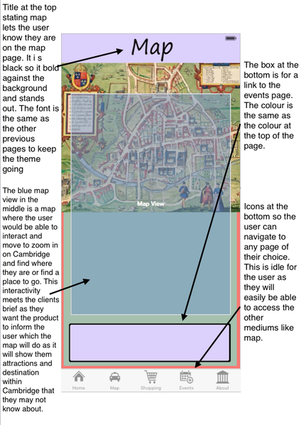
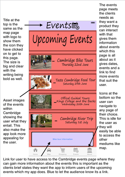
- A map - This is where the user can navigate through Cambridge. This is particularly important to tourists as they will then be able to find their way though the city as well as finding new destination to travel to within Cambridge, we will also offer a suggestion of where the user can get a coffee and relax during their stay. We have adding Starbucks as the destination as the franchise will be recognisable to all users as it is a well know brand allowing the user to feel familiar with the city, so they can feel at home.
- Links to website through the app - This is where the user can press a link on one of the pages and be able to load a webpage through the app, this page will be the Starbuck information page as well as a Cambridge events page. This is important for the tourists so then they can find something to do within the city and find an event that appeals to them.
- I am considering video content for my app - This would be a promotional video of Cambridge. This would be important as it can promote for tourist attraction within the video that they may want to visit after watching it.
- Basic interactivity would be the menu bar at the bottom where the user can navigate from page to page. This is important as some pages will have information of Cambridge on them which is what the client wants and what the purpose of the app is ( "to be a source of information for locals about what events are happening.")
The homepage will have buttons at the bottom, location which will be a map, shopping areas, about page which is a bout Cambridge and a gallery. I intend to do this by creating buttons that are clear to identify The shopping section will have content of different shops to go to and best of the week. The Cambridge quiz will be to test the knowledge of the user about Cambridge. The history content will have pictures and facts gathered from reliable sites. The gallery will be a selection of different photos.
Format
The format will be for an IPhone 7 because it is the most recent released phone for IOS. Therefore the format I'm using is IOS as i know about that format and use it myself. This is format is good for the user as it is simple to use and most people around the world have phones and have access to the app store where they can get the app. It is said that in 2015 Apple has sold over 700 million IPhones making it the perfect platform for my app. In future years the app could be adapted for android devices.
Platform Budget
To make an app there are a lot of different requirement needed which could cost me. For example a coder with experience will be needed to pay for, this will ensure a good looking app that works at high quality. I went onto a coding website called "createanet" and asked them how much app coding is per hour this was their response. However because this is a low budget production, I will be coding myself as this is cheapest.
Another issue is copyright as I'm using images on my app and if I were to use someone else's images and pictures this would break the law so i have to ask the person to use their photos in my app, to avoid this i will be taking my own pictures so i won't run into issues regarding copyright with pictures. However if i were to use someones pictures i may have to pay royalty on the images to the owner. To avoid copyright issues i need to ask the government for a patent so that no one can copy my work and use it for their own. This means paying a fee to secure my apps safety. This includes international payments to ensure no one ensure copies my work. The sum of this is unknown as its displayed by product. I will need to follow accuracy as i am gathering information about Cambridge to put in an "About" section which need to be completely true so I'm not misleading the user or misrepresenting Cambridge itself. We can keep cost down by hosting the app on the Apple app store where cost can be kept to a zero as there is no charge for hosting on the Apple app store.
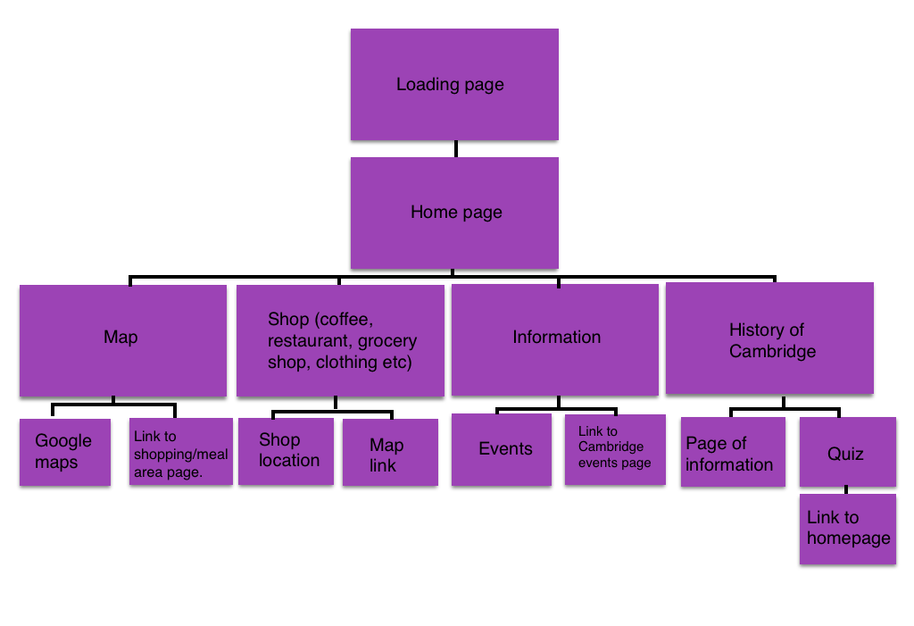
Navigation Map
Storyboard
Imaginary entity
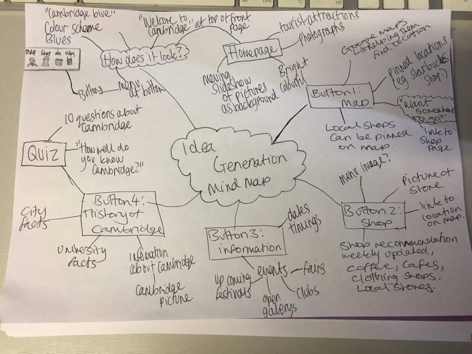
Mind Map
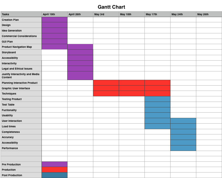
Gantt Chart
Moodboard of content
Commercial considerations
For my app I have room for commercial considerations like sponsors for example for my events page i am having a live link to a Cambridge events page which could be a way in which I get money from the Cambridge events website owners as I am promoting their page and bringing them more views. Also when I'm promoting the cafes and restaurants etc, I could get money from advertising their shops/products which I could be paid for by the company. However promoting a product without permission could resulting in me being fined for copyright and intellectual property stealing as I am promoting someones company.
For my app, in terms of commercial considerations i could also get another sponsor from a company like Starbucks. This would be a great way to get money from Starbucks as I am already putting Starbucks within my app as a place the user can go. This way I can gain money to help make my app better. This would be easy to adapt as all i would need to do is advertise the brand name of Starbucks and promote the company which i am already doing. Also again with my events page sponsor the events could have a download voucher where when they click on the link and go to the page they can download a voucher for 10% off a punt tour. This is where i can advertise the company and voucher and the company gain money and fund my app as well.
For my app, in terms of commercial considerations i could also get another sponsor from a company like Starbucks. This would be a great way to get money from Starbucks as I am already putting Starbucks within my app as a place the user can go. This way I can gain money to help make my app better. This would be easy to adapt as all i would need to do is advertise the brand name of Starbucks and promote the company which i am already doing. Also again with my events page sponsor the events could have a download voucher where when they click on the link and go to the page they can download a voucher for 10% off a punt tour. This is where i can advertise the company and voucher and the company gain money and fund my app as well.
Graphical User Interface (GUI)
My GUI needs to be easy to use as my age range is fairly big and because the older generation may not be so fluent on technology it needs to be basic and easy to use. To make sure its basic I will not have too many pages also with icons and buttons as it will get confusing otherwise. My GUI needs to be visually pleasing as people will be using it and interacting with it and if it doesn't look very pleasing then people won't want to use it and interact with it. For written form i need to make sure the vocabulary is easy to read and very universal as if i were to use ambitious vocabulary some people won't understand it.
My GUI needs to be easy to use as my age range is fairly big and because the older generation may not be so fluent on technology it needs to be basic and easy to use. To make sure its basic I will not have too many pages also with icons and buttons as it will get confusing otherwise. My GUI needs to be visually pleasing as people will be using it and interacting with it and if it doesn't look very pleasing then people won't want to use it and interact with it. For written form i need to make sure the vocabulary is easy to read and very universal as if i were to use ambitious vocabulary some people won't understand it.
|
Sourced Image: http://www.civicheraldry.co.uk/east_anglia_essex.html
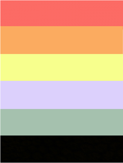
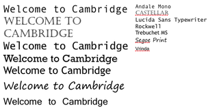
These are the kind of colours I want in my app as they are inspired by the colours in the Cambridge City logo. I've decided that going for a more pastel colour will be more appealing to the audience as sharp colour may not look as nice and aesthetically pleasing than pastel colours. The fonts above are also options for my app, they are easy to read so that everyone in my target audience can read it as well as none of the fonts being too "fancy" that their too hard to read so I have used simple fonts.
|

|
|
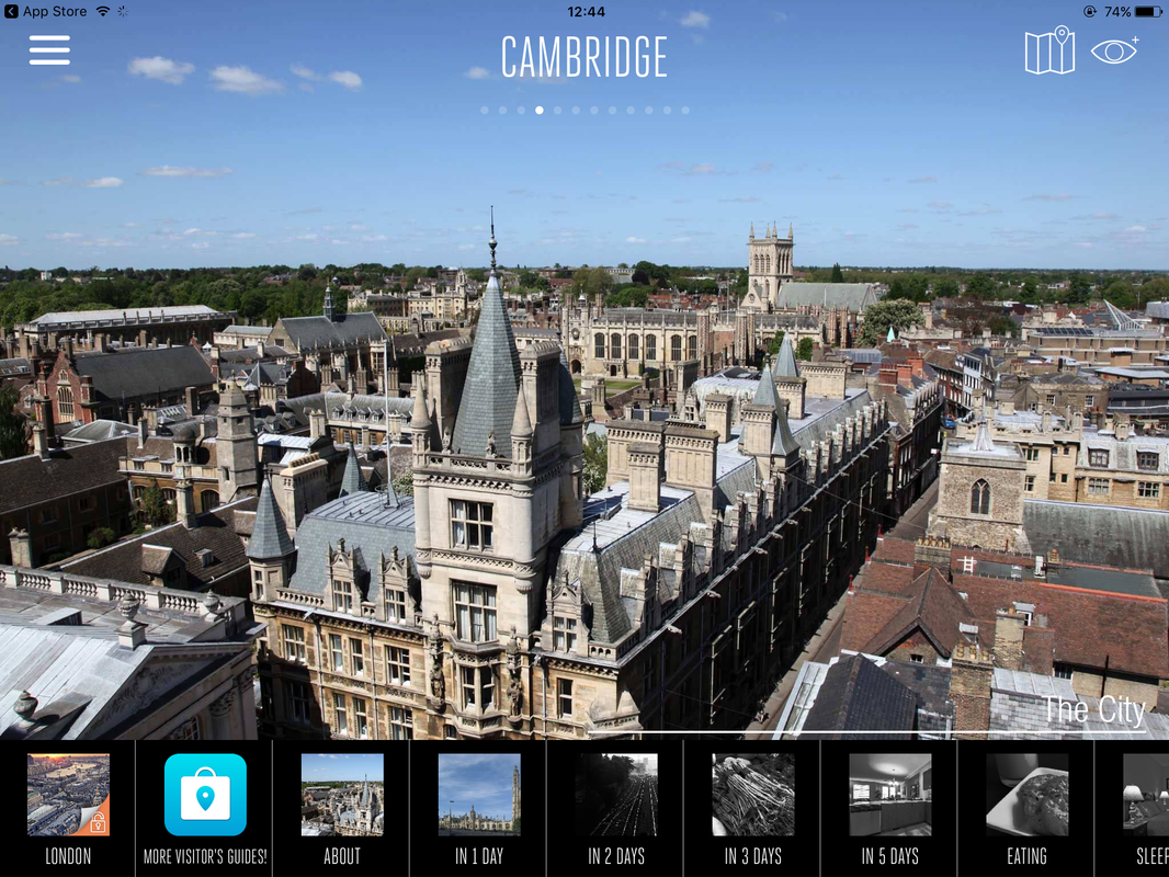
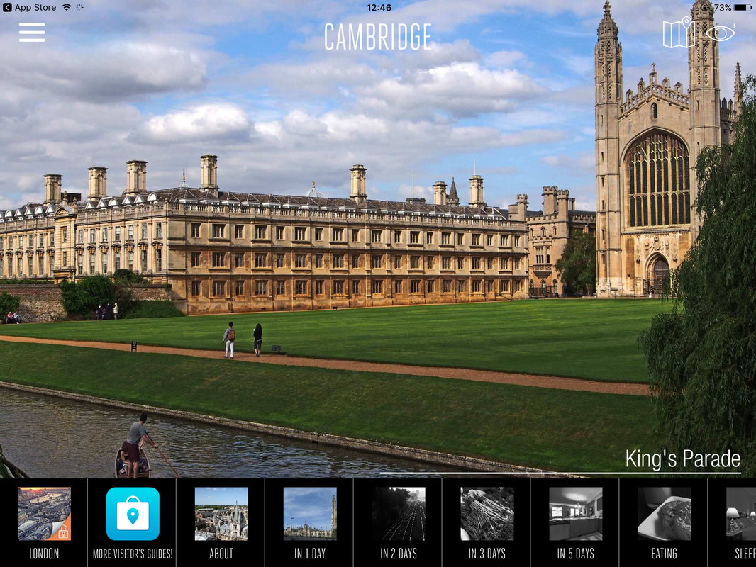
App name : Cambridge Travel Guide and Offline city Map
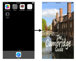
This Cambridge travel guide app is inspiring my app with the simple font and nice pictures on the home screen to appeal to the audience making the app look professional making people want to continue using it. However my app will be portrait whereas this app is portrait.
This Cambridge travel guide app is inspiring my app with the simple font and nice pictures on the home screen to appeal to the audience making the app look professional making people want to continue using it. However my app will be portrait whereas this app is portrait.
Accessibility
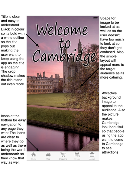
The accessibility of my app will be easy and simple. On the home page it will display 4 buttons at the bottom of the page. These will be "Map, Shopping, Information and History " the user then can pick on one for example, Shopping and it will take them to the shopping page so they can access more information about the shopping area around Cambridge. After reading the recommendation they can click the picture of the shopping place and it takes them to the page. There is also a live link on the page that takes them to the map page where they can find the shop recommended so they can try it out and see what they think themselves. Once the user is done a back button can be pressed to go back at the top of the page. This will take the user back to the homepage where they can access a different page agin with the page displayed with icons at the bottom. The app will be access via IPhone 7.
The accessibility of my app will be easy and simple. On the home page it will display 4 buttons at the bottom of the page. These will be "Map, Shopping, Information and History " the user then can pick on one for example, Shopping and it will take them to the shopping page so they can access more information about the shopping area around Cambridge. After reading the recommendation they can click the picture of the shopping place and it takes them to the page. There is also a live link on the page that takes them to the map page where they can find the shop recommended so they can try it out and see what they think themselves. Once the user is done a back button can be pressed to go back at the top of the page. This will take the user back to the homepage where they can access a different page agin with the page displayed with icons at the bottom. The app will be access via IPhone 7.
Interactivity
Within my app I was have many forms of interactivity for example, Quiz, Map, Live links to web pages, picture links (clicking on a picture to get to a web page). The quiz will be an enjoyable feature of the app adding some aspects of entertainment into my app so they enjoy their time using the app. The questions will be random appropriate questions about Cambridge so that the quiz can be played by all ages and people. The links to web pages will be important for my app as they help me give the user information without cramping up app. Also the user will be interested in the links has they allow them to discover more about what ever they want. This also includes the link to the other pages within my app as they are relevant to the current page and allow the user easy access to the necessary pages e.g. Map when on shopping locations. The picture links are similar to this as they let the user click on an image to find more information this will be used in the shopping page as they can click the image and view their website.
Within my app I was have many forms of interactivity for example, Quiz, Map, Live links to web pages, picture links (clicking on a picture to get to a web page). The quiz will be an enjoyable feature of the app adding some aspects of entertainment into my app so they enjoy their time using the app. The questions will be random appropriate questions about Cambridge so that the quiz can be played by all ages and people. The links to web pages will be important for my app as they help me give the user information without cramping up app. Also the user will be interested in the links has they allow them to discover more about what ever they want. This also includes the link to the other pages within my app as they are relevant to the current page and allow the user easy access to the necessary pages e.g. Map when on shopping locations. The picture links are similar to this as they let the user click on an image to find more information this will be used in the shopping page as they can click the image and view their website.
This is my Navigation map
Explain Legal And Ethical Issues Relating To Product Ideas
When creating my app i must think about the legal and ethical issues regarding my app and the aspects within it. This would ensure the feasibility that my app could actually be bought on the app store and is actually allowed to be sold.
The copyright rule applies to my app largely as it ensures my apps safe and make sure I'm not using other peoples images. The Copyright, Designs and Patents Act says that creators have control over their work and property and the use of it. This means that when gathering images and assets for my product that none of the pictures are protected by copyright and that all the ideas I have are my own intellectual property and not someone else idea. I would probably have to reference the artist and owner within my app to make sure they are credited and not me. If i were to find copyright images i must ask the owners permission to use the pictures in my app. I could find image that are royalty free and copyright free to ensure my safety with my app this way i won't get sued. The buttons i am going to be using in my app are primary sourced and created by me so i do not have to worry about copyright here. However if i were to be using buttons from different apps or website then i would have to ask permissions and reference them in my app. This is the same with fonts as some fonts a copyright like on websites like Bitesize, Facebook ect. Therefore i will use a font that is generic and available to all users so i know its royalty free and won't cost me to use and i won't get into trouble. I f i were to have videos within my app i would need to ask the creator for permission or create it myself i don't plan on having a video with my app anyway. I am creating all the work, the design, name, layout and everything however because i am making it for a client the property belongs to them and i do not own any of it. To protect my app a patent can be placed on the app to make sure no one steals it. This is a government license that says the product is mine and not for others to use.
Data protection is relevant for an app like mine as similar app may ask for a login and a bit of information from the user like full name, age, gender to make the app more personalised to them. However my app does not require a log in as i do not think it is neccesary for my app. But if i were to have data collected then i would need to keep it all confidential and safe so that no users information is distributed anywhere as this would break the law on the data protection act. This connects to the clients brief as they want to have information in my app so have to be careful that the information that i get is about Cambridge a not about any residents so that their data is protected.
Cyberstalking is very unlikely within my app as i won't be gathering peoples information nor distributing any ones so therefore there is no one to cyber stalk. This could relevant if the app had a comment section that wasn't anonymous as someone could look into someone and stalk them. However this will not occur in my app as no one is able to comment of add any data into the app.
Identity theft is not relevant to my app either as no one data is being added into my app meaning there is no way for someone to steal some identity nor would i be able to as i have none of their data. This could happen if you had to buy something within the app the card could be stolen or identity when signing up for something but my app has neither of those features.
For ethnical issues the first one is misrepresentation. This is relevant to my app as i am representing Cambridge within my app so i have to make sure that i don't represent it wrongly. Also i have to make sure I'm not bias about the app as this may be misrepresentation as if i were to speak negatively about the app the whole time and say nothing positive this would biased and misrepresentation as it makes it seem like there is nothing positive in Cambridge. No one is being represent in my app so i dont have to worry about misrepresenting someone. Decency is not relevant to my app as i am not using inappropriate language or images that i know will offend the user. Libel, like misrepresentation is when a false statement that could offend someone. Nothing that I write within my app is made to offend and only to inform and educate. This links to the client brief as they have asked me for information and i don't want to find information that could be misleading for the user as this is unethical as I might sway the audience and user as the content may be biased.
In terms of the clients brief the client has asked me to "source information" this can be a legal issue as depending on the site i gain the information from the information may be false or inaccurate so this may break the legal code of Accuracy. This is a danger as the client wants information so that the user can start to gain some facts about Cambridge and feel more involved in the city. This is a danger as my company may be sued for using false information and misrepresenting the city. This also may make the app void where it would not allowed to be used anymore and taken down as the information is false.
Again with the client brief it said "All content produced must be original and produced by you." this could raise a concern with legal issues as even though some one may create there own must or content it may have been some else's intellectual property which is a legal issues as the original creator may sue me if I use their idea in my app. To avoid this I am going to use royal free images, this ensures my safety with the images so i don't get sued.
Justify The Planned Interactivity And Range Of Media Content To Meet A Client Brief
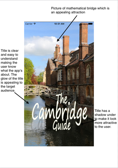
My app is called "Cambridge Guide" letting the user know that the app is about Cambridge and that the app with help them navigate through Cambridge and know about it. Here are some ideas of how I want the app to look.
When creating my app i must think about the legal and ethical issues regarding my app and the aspects within it. This would ensure the feasibility that my app could actually be bought on the app store and is actually allowed to be sold.
The copyright rule applies to my app largely as it ensures my apps safe and make sure I'm not using other peoples images. The Copyright, Designs and Patents Act says that creators have control over their work and property and the use of it. This means that when gathering images and assets for my product that none of the pictures are protected by copyright and that all the ideas I have are my own intellectual property and not someone else idea. I would probably have to reference the artist and owner within my app to make sure they are credited and not me. If i were to find copyright images i must ask the owners permission to use the pictures in my app. I could find image that are royalty free and copyright free to ensure my safety with my app this way i won't get sued. The buttons i am going to be using in my app are primary sourced and created by me so i do not have to worry about copyright here. However if i were to be using buttons from different apps or website then i would have to ask permissions and reference them in my app. This is the same with fonts as some fonts a copyright like on websites like Bitesize, Facebook ect. Therefore i will use a font that is generic and available to all users so i know its royalty free and won't cost me to use and i won't get into trouble. I f i were to have videos within my app i would need to ask the creator for permission or create it myself i don't plan on having a video with my app anyway. I am creating all the work, the design, name, layout and everything however because i am making it for a client the property belongs to them and i do not own any of it. To protect my app a patent can be placed on the app to make sure no one steals it. This is a government license that says the product is mine and not for others to use.
Data protection is relevant for an app like mine as similar app may ask for a login and a bit of information from the user like full name, age, gender to make the app more personalised to them. However my app does not require a log in as i do not think it is neccesary for my app. But if i were to have data collected then i would need to keep it all confidential and safe so that no users information is distributed anywhere as this would break the law on the data protection act. This connects to the clients brief as they want to have information in my app so have to be careful that the information that i get is about Cambridge a not about any residents so that their data is protected.
Cyberstalking is very unlikely within my app as i won't be gathering peoples information nor distributing any ones so therefore there is no one to cyber stalk. This could relevant if the app had a comment section that wasn't anonymous as someone could look into someone and stalk them. However this will not occur in my app as no one is able to comment of add any data into the app.
Identity theft is not relevant to my app either as no one data is being added into my app meaning there is no way for someone to steal some identity nor would i be able to as i have none of their data. This could happen if you had to buy something within the app the card could be stolen or identity when signing up for something but my app has neither of those features.
For ethnical issues the first one is misrepresentation. This is relevant to my app as i am representing Cambridge within my app so i have to make sure that i don't represent it wrongly. Also i have to make sure I'm not bias about the app as this may be misrepresentation as if i were to speak negatively about the app the whole time and say nothing positive this would biased and misrepresentation as it makes it seem like there is nothing positive in Cambridge. No one is being represent in my app so i dont have to worry about misrepresenting someone. Decency is not relevant to my app as i am not using inappropriate language or images that i know will offend the user. Libel, like misrepresentation is when a false statement that could offend someone. Nothing that I write within my app is made to offend and only to inform and educate. This links to the client brief as they have asked me for information and i don't want to find information that could be misleading for the user as this is unethical as I might sway the audience and user as the content may be biased.
In terms of the clients brief the client has asked me to "source information" this can be a legal issue as depending on the site i gain the information from the information may be false or inaccurate so this may break the legal code of Accuracy. This is a danger as the client wants information so that the user can start to gain some facts about Cambridge and feel more involved in the city. This is a danger as my company may be sued for using false information and misrepresenting the city. This also may make the app void where it would not allowed to be used anymore and taken down as the information is false.
Again with the client brief it said "All content produced must be original and produced by you." this could raise a concern with legal issues as even though some one may create there own must or content it may have been some else's intellectual property which is a legal issues as the original creator may sue me if I use their idea in my app. To avoid this I am going to use royal free images, this ensures my safety with the images so i don't get sued.
Justify The Planned Interactivity And Range Of Media Content To Meet A Client Brief
My app is called "Cambridge Guide" letting the user know that the app is about Cambridge and that the app with help them navigate through Cambridge and know about it. Here are some ideas of how I want the app to look.
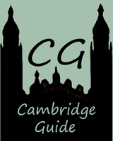
I do not think that this colour back ground is very nice because in terms on misrepresentation as the colour is not very appealing as the icon as the shade is dark with connotations of mould and can be seen as bland. By using these colours it could represent Cambridge in a negative way as it denotes boredom and unpleasantness.
This is better for my app as it similar to the above logo with just the CG and also the city logo too lets the user know that app is about Cambridge. Also the colours are better as they link to each other with the red in the logo and the text underneath. Also the colours here are much brighter and bolder which will appeal to the audience more.
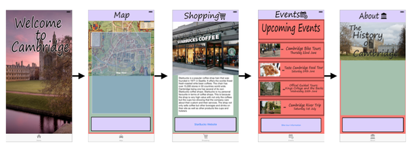
Navigation Map
|
|
Loading Page
Home Page
Map Page
Shopping Page
Events Page
About
Why these colours?
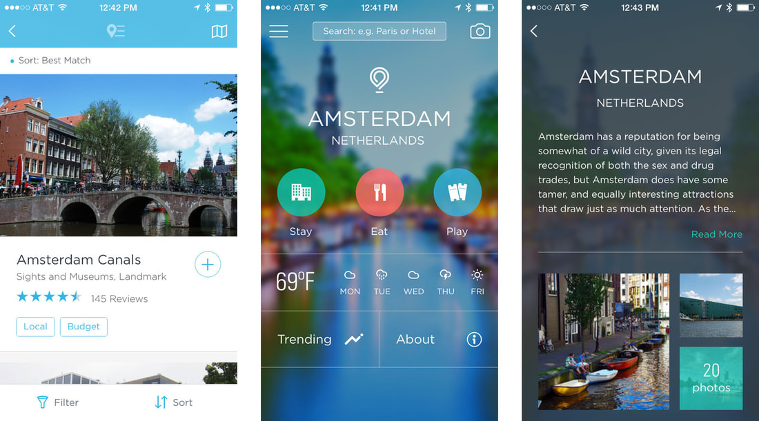
Ive decided to go for bright pastel colours because its more visually pleasing for the user because the bright colours will attract them to the app as they look inviting but the effect of pastel will make the app look more relaxing and easy to read because i believe if the colours were bright red and green it would look to gimiky so the pastel colours calm it down to. Similar pastel colour can be seen in other popular city guide apps like Amsterdam.
Ive decided to go for bright pastel colours because its more visually pleasing for the user because the bright colours will attract them to the app as they look inviting but the effect of pastel will make the app look more relaxing and easy to read because i believe if the colours were bright red and green it would look to gimiky so the pastel colours calm it down to. Similar pastel colour can be seen in other popular city guide apps like Amsterdam.
|
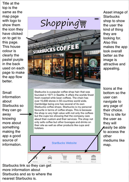
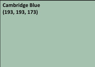
The green pastel colour I used is actually called Cambridge blue and i thought that way it makes it even more relevant to have that colour in the app. The purple pastel I used i think really complements the Cambridge blue on the shopping page. Also purple and blue are very similar colours and are made with similar properties so they work well together.
|
|
The red colour is the similar colour to the red within the app logo and the Cambridge logo which is why i wanted to make a similar red just a softer tone so its easy on the eyes for the user. Also the purple i used is similar to the purple seen on the home screen on the sky so i followed the theme to help the app flow.
|
Benefits of using the interactivity in my app:
|
Limitation of using the interactivity in my app
|
On the loading page, I made the font White because I know its bold and bright so everyone can read it. The only thing I would
Here is the final storyboard I have had to take away the Quiz pages as I do not have enough time to make the pages and finalise them.
