P5: Carry out post-production techniques and processes to produce a final original media product in line to the client brief
Reviewing suitability of photographs
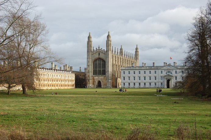
This picture is suitable for my product as it showcases the university which is what i wanted as well it being very central in the picture so the attention is all on the university its self. A strength of this photo is that its good quality and makes the university look good and of high quality. A weakness could be the fact there is no sun in the picture which isn't great but to change this and make it better i am going to be adding a sun and lens glare giving the effect of sunlight. Also by adding brightness and contrast will add light and enhance the shadows making the illusion of sunlight.
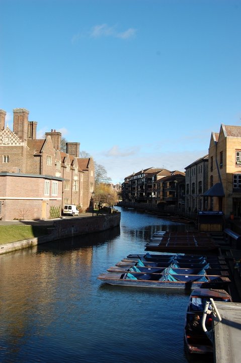
I think this picture is suitable for my product as the sunlight adds appeal to the picture making Cambridge look like a beautiful sunny city. However a weakness is that there are a lot of shadows in the picture darken it and taking away from the punts. But I do this a strength is the reflection on the water and sky is nice and clear making Cambridge look beautiful again. To brighten the image i will increase the brightness and saturation to make it more more appealing.
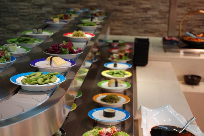
This picture may be suitable for my product as it shows the culture in Cambridge as the food range is large and inviting of all cultures. A strength of this is that the focus is effective as it gives the effect that the focus of Cambridge is to be culturally diverse by focusing on the food commonly from different countries.
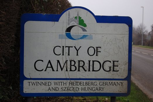
After editing this picture may be suitable for my product as it shows that Cambridge is welcoming with the sign fist shown to people entering the city. A strength is that the audience will be feel welcomed by the sign however a limitation is the dirt on the sign is not very appealing.
Decisions list, photos I'm not using and why
Edit Decision List by charlotte on Scribd
|
Rough Edit 1
Billboard
|
Layers
|
|
Poster
Sub-editing
|
Layers
|
Billboard
Poster
Billboard screen recording
Poster screen recording
Audience feedback
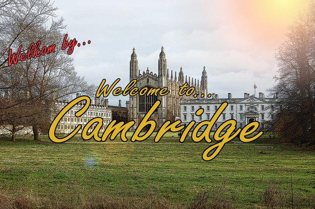
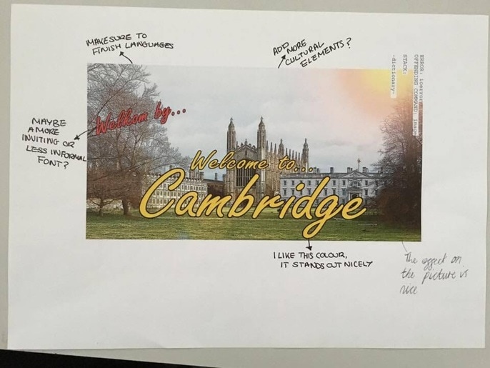
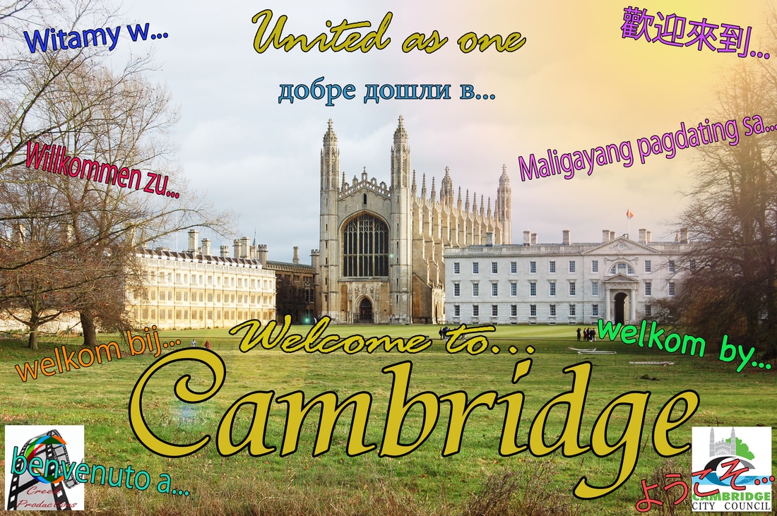
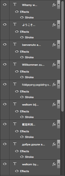
After receiving my feedback from my fellow students and somewhat target audience the first piece of advice was about my Billboard, the audience feedback stated that the writing above “Welcome to… Cambridge” that said “Welkon by…” wasn’t very clear, they explained that it could be made larger and or the outline made a different colours. Due to this feedback I am going to do both. I will increase the size of this phrase and additional phrases so they are bolder and more clear. I will also change the colour of the outline or see how it looks bigger. A point was made about maybe I could change the font for each language that I do so it is more personal to the language and culture. Also maybe change the colours for the countries flag. Try and highlight the target audience of students more with my brightness on the college itself.
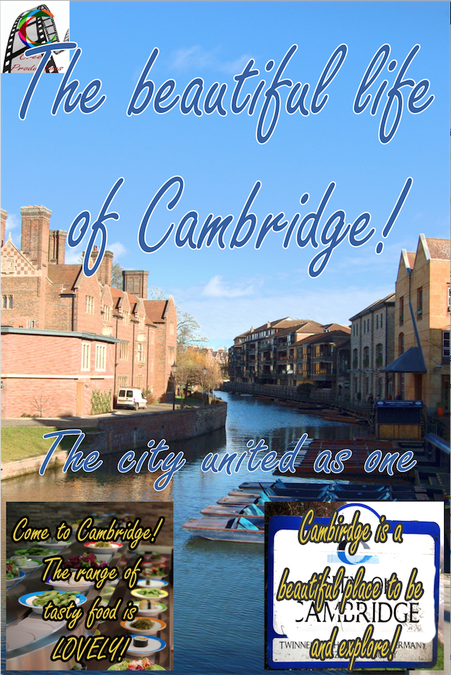
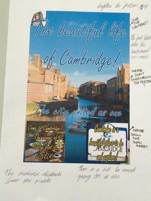
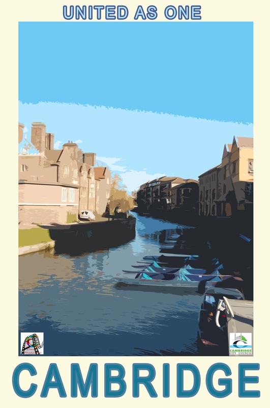
For the poster it was clear that the target audience didn’t particularly like the mass of writing therefore i may delete the writing within the pictures at the bottom for its simpler, easier and more appealing tot the eye. The boxes (pictures) could be rounded off more and fit more with the behind picturE.Therefore I will soften the edges and flatten the picture more into the background for its simpler. Due to feedback i will change the font colour as it is too similar to the sky and fairly hard to read. Unless deleted i will change the spelling of Cambridge as there was a mistake. I may change the title so it appeals to more people as it seems like Im only trying to appeal to people who want to live here. It was suggested that I change the slug line and shorten it to only “united as one” so it appeals to more onlookers. If I were to change the slug line to a shorten one I was suggested to change the beginning letter to a capital so its more of a statement. Due to my audience saying the sign looking old i will edit it more and fix the picture so its more attractive to onlookers. So what I got from my audience feedback and what I will change is make the poster simpler and the billboard bolder and brighter by changing the sizes and colours on the “Welcome to…” in different languages.
For the poster it was clear that the target audience didn’t particularly like the mass of writing therefore i may delete the writing within the pictures at the bottom for its simpler, easier and more appealing tot the eye. The boxes (pictures) could be rounded off more and fit more with the behind picturE.Therefore I will soften the edges and flatten the picture more into the background for its simpler. Due to feedback i will change the font colour as it is too similar to the sky and fairly hard to read. Unless deleted i will change the spelling of Cambridge as there was a mistake. I may change the title so it appeals to more people as it seems like Im only trying to appeal to people who want to live here. It was suggested that I change the slug line and shorten it to only “united as one” so it appeals to more onlookers. If I were to change the slug line to a shorten one I was suggested to change the beginning letter to a capital so its more of a statement. Due to my audience saying the sign looking old i will edit it more and fix the picture so its more attractive to onlookers. So what I got from my audience feedback and what I will change is make the poster simpler and the billboard bolder and brighter by changing the sizes and colours on the “Welcome to…” in different languages.
Rough edit 2 - Poster
Poster screen recording 2
Finished edit 1 - Billboard
Billboard screen recording 2
|
Layers
|
|
Finished edit - poster
|
Layers
|
|
Layers
|
Poster screen recording 3
For the purpose of my blog I have uploaded my billboard and poster in the format of JPEG so my client can see the picture clearly and easily. When sending my Billboard and poster to my client for approval I would send a JPEG because the format is easy to use and you don’t need certain applications to open the picture. When sending my Billboard and Poster to a printing company I would send a PSD format (Photoshop format) for the best quality for them to print on for my distributing formats.
Setting up software
M4: Demonstrate how the exported media product meets the client brief
The genre of my piece is a Promotional poster/billboard.
|
Conventions of a Promotional poster -
|
Conventions of a Promotional billboard -
|
|
|
> Which file format did you export to?
I exported the file as a JPEG.
> Why was this?
I exported this as a JPEG because the files have high degree's of compression so the file size is much smaller and easy to move around onto different portable disc drives. Another reason I exported the file in the format JPEG is because it is compatible on a wide range on devices and is displayed correctly in any browsers, text and graphics programs, on different computers, tablets and mobile devices. Also the picture quality is high with small degree of compression.
> What implications does it have for delivery client?
The implications for the client is that the file is smaller meaning that the client can distribute the images onto more mediums.
> How does this file format meet the clients brief?
The file format meets the clients brief because the format is easy to distribute so it can promote the cultures in Cambridge quicker. So because it is small you can upload the images to different channels like, Facebook, websites as well as it easy to move to distributing companies that can put the images on bus stops or billboards.
> Where could the client digitally distribute the product using this file format?
I would suggest both social media and traditional ways for the main distribution because it can be put on Cambridge social media platforms. This would be beneficial because social media can meet a large audience. In addition, putting the image on and East Anglia page would be good because the brief is about the region competition so putting our image on the page would give our city publicity to our audience. In terms of traditional, the images could be printed (especially the poster) which can be displayed around surrounding towns and villages. The billboard can be put on buses and billboards on motorways in near round cities.
D1: ANALYSE HOW POST-PRODUCTION TECHNIQUES AND PROCESSES CREATE MEANING IN THE MEDIA PRODUCT TO MEET THE CLIENT BRIEF
> Analyse how post-production techniques and processes enhance meaning in the final product for example:
Evidence of filters used to support analysis
Evidence of filters used to support analysis
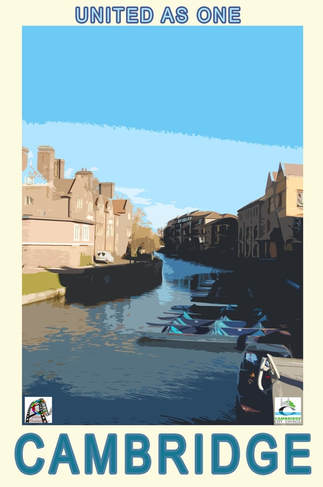
I used editing techniques to improve the billboard and make sure my audience will be engaged and intrigued by the poster and want to come to Cambridge. Firstly, when starting editing the first thing I did brighten the image because the picture was too dull and didn't promote Cambridge in a very positive way. I also added contrast so the brightness looked more real as the shadows were also enhanced. The next thing I added was the text "Welcome to Cambridge" which is the main font of the billboard. I did this so that the target audience know what the billboard is about as well as being an intimation to Cambridge. This meets the client brief too because the client asked for a piece that was cultural and this title is very inviting to the different cultures and people who want to come to Cambridge. After this I added the sun effect. This creates a positive and beautiful atmosphere for Cambridge. Sunshine connotes beauty and hope which is what I want my audience to see. I added the lens flare to make the sunshine seem more realistic. This meets the client brief because they asked for piece that is entertaining as well as promoting the city which is why I added the piece that make the city much more appealing to the eye which the client wanted. The next thing I did was started adding text and making the piece more cultural and appealing to different cultures and people. The pieces of text around "Welcome to Cambridge" all say "welcome to" in different language to promote that we are culturally diverse but also to appeal to people from different place and make them want to visit Cambridge. The different languages meet the target audience because the client has asked for a piece that displays the cultural parts of the city so the languages show the different cultures within Cambridge. The image itself shows the beauty and history within Cambridge and what people can expect to see here. The client asked to see the cities unique identity and I believe the college makes the city very unique and will make people want to come see it.
Evidence of filters used to support analysis
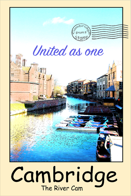
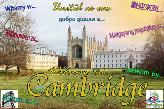
When editing my Poster, I started by adding an filter to the image, this was called "Cutout" on photoshop, this made my image more cartoony and inviting. This would also appeal to a wide range of people, young and old. This filter is very different which the client wanted "a piece that sows the towns unique identity". The filter gives the city the look of it being different and uniques so people want to come and see whats different about it. After this I started to bring up the brightness and contrast, this I struggled with because the brightness didn't work fully on the the shadows and the contrast helped the picture in some part but only darkened the already dark parts (shadows). So I had to cut a small section of the picture on its own so it was brighter than the rest. The next step was adding text, the first thing I put was "The beautiful life of Cambridge" but I decided to change the title to just be Cambridge. This is because previous used promotional content for cities only had the city name. I also added the tagline "United as one" which will tell the audience that we are cultural and diverse. The client wants a product that displayed the cultures of Cambridge. So the caption "UNITED AS ONE" was done to show the cultural diversity the city has which is what the client wants. The clients feedback made me change my idea slightly, so in terms of this the first thing I did was copy the merged layers and make the image smaller. This allows me to have border around the outside the image. This is done to create a postcard like effect which will appeal to tourist and my target audience as it is inviting and engaging. The client has asked for a piece that is entertaining to the audience having a postcard like effect to appeal to the target audience and engage them making them want to come to Cambridge. I then moved the text from the image to the border so its easier to read but also so the audience can see the image clearer. This creates meaning because it helps show the beauty of Cambridge through the picture and the lack of text on the picture helps draw attention to this. I changed the colour of the border so it looks more like a postcard. This adds to the history of the city as the colour reflects the age of the buildings and history. This also emphasises the history of the city which makes it unique. This meets the client brief because they have asked for a piece that shows the unique features of the city so the punting and architect.
Present the media product to the client/focus group in order to obtain feedback at various stages of production.
This audience feedback is for my online edit. The feedback was a lot more positive over my offline feedback. My audience enjoyed the bright colour in my poster and thought it was attractive to the eye. She also stated she thought it was very welcoming and people would want to come to Cambridge after seeing it. Some criticism was that the audience thought the text United as one was too comic but the Cambridge font she liked. With the billboard my audience member loved it. The languages (she thought) were very inviting and showed we are excepting. She also said the logos of the companies was very professional. She stated that the font for "united as one" can sometimes be hard to read especially for a billboard. However she liked both and said that in comparison to my offline they are much better so with this feedback I will be sending this to the client as my target audience like.
